WeHaul
Transforming Landscaping Logistics: A Deep Dive into the Success of WeHaul — The Premier Material Delivery App.
Context
New Jersey locals had difficulties scheduling and transporting landscaping materials for their homes without paying a premium. They wanted to be able to reach out to local truck drivers and hire them to transport their orders from nurseries and landscaping businesses directly to their homes at a more affordable rate.
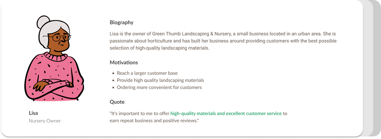
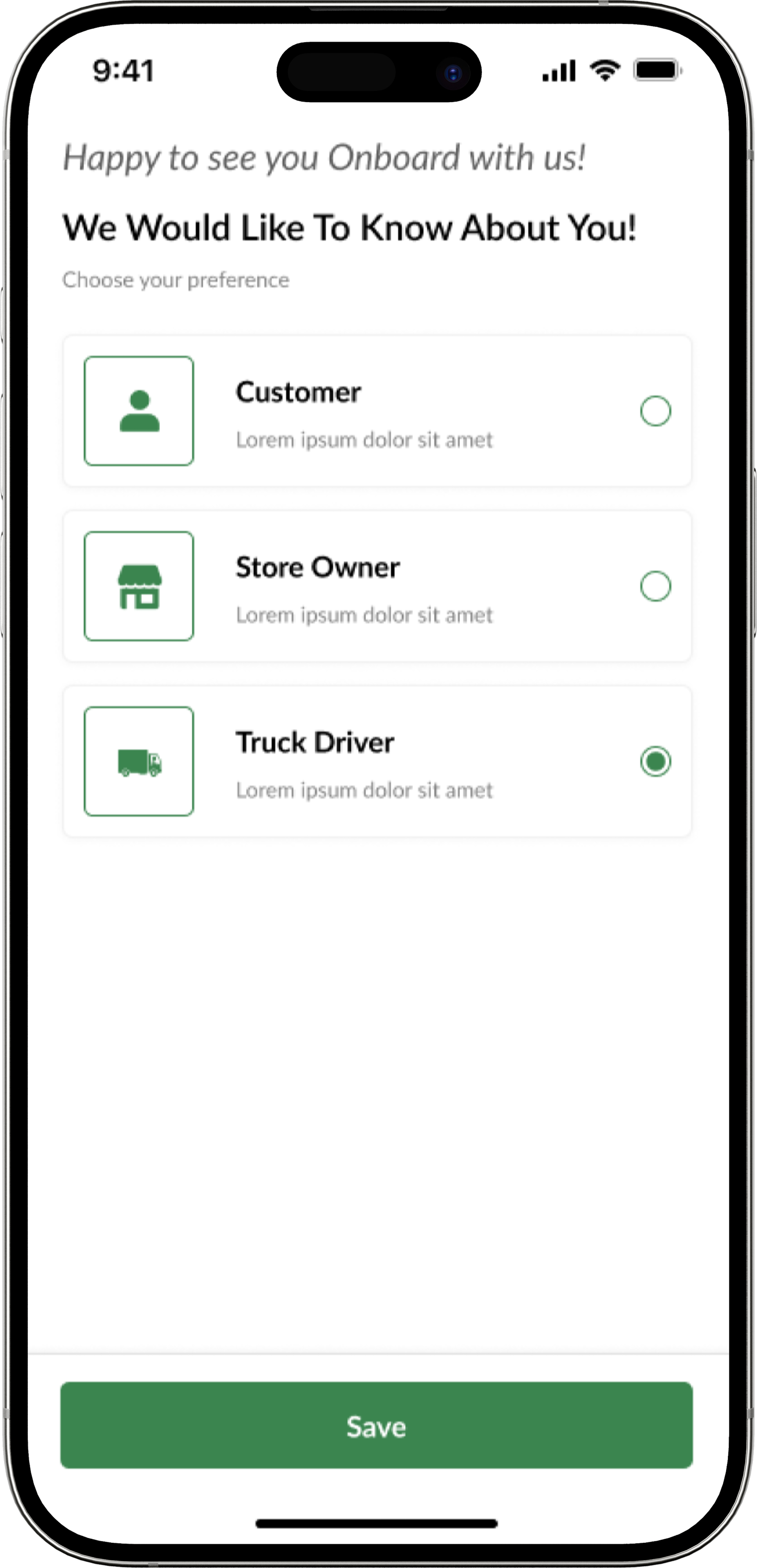
Our client wanted the mobile application to be customized into three different logins. Our challenge was creating a cohesive system that could translate easily across all three users. It was important for us to analyze the problem from three different perspectives: homeowners, nursery owners, and truck drivers.
User Research + Personas
Knowing our three target audiences, I began to conduct research. I first assessed all of the functionalities I thought would benefit all three users. How can I create a seamless experience for all users with different user experiences in the mobile application? Being able to create harmony within multiple designs is crucial for a successful mobile application. I began creating user stories in tandem with the client to have an in-depth understanding of the different potential users.
Key Pain Points
"I hate spending so much money on delivery fees." — Homeowner
"I want to be able to advertise my plants and landscaping materials easily." — Nursery Owner
"I want to be able to make more money with my trucking license." — Truck Driver
Initial Ideas
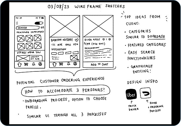
The first working session with the client was about scope rather than screens. We mapped what each of the three users needed to accomplish, and where their paths would have to intersect — a homeowner placing an order, a nursery confirming stock, a driver accepting the haul. Those notes set the boundaries for everything that followed.
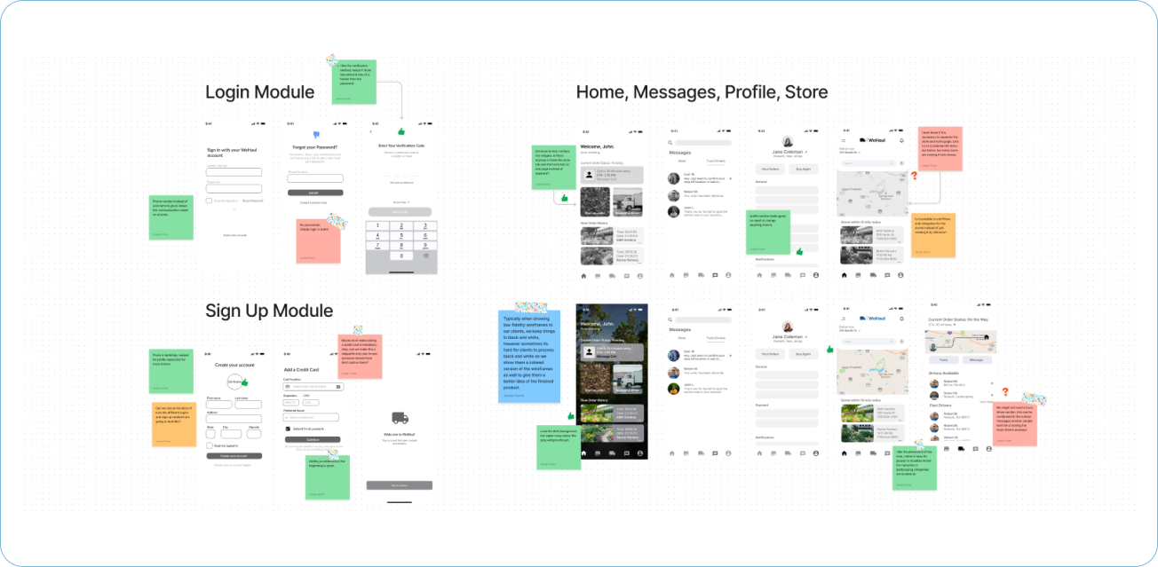
Notes from the initial client discussion, mapping the three user types and where their workflows connect.
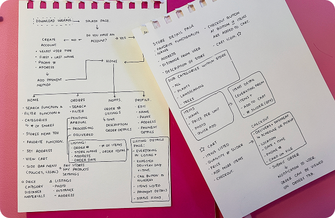
Data Flow Diagram
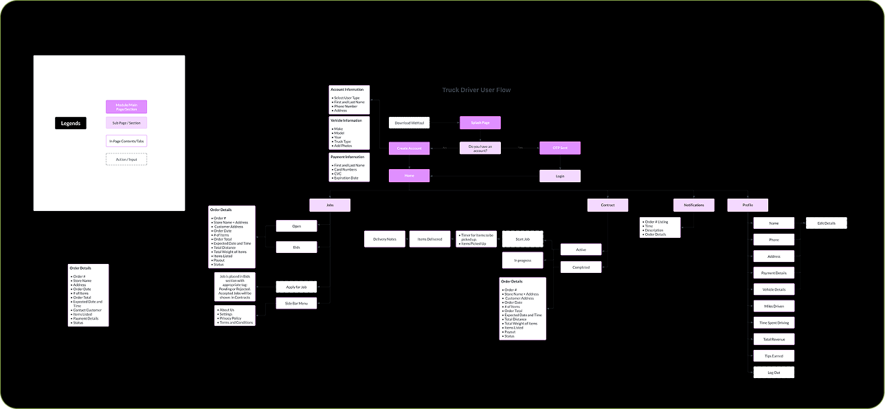
After talking to the client and getting the main idea of the application, I begin to work on a User Data flow for all 3 users. This is reviewed alongside the client to ensure everyone is on the same page before moving on to wireframes.
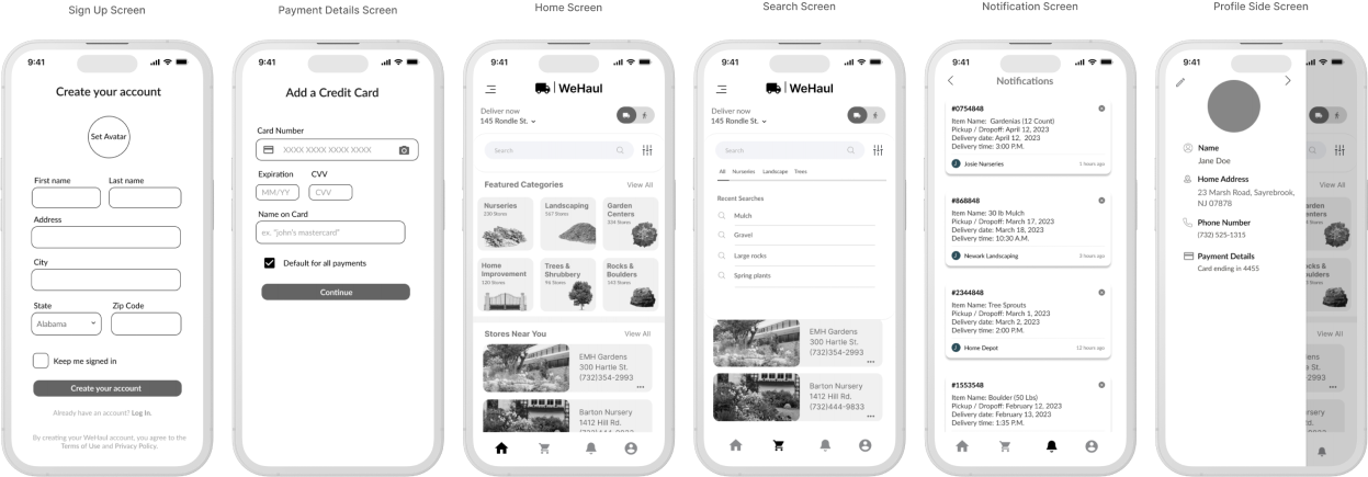
Low Fidelity Wireframes
Once we have finalized the User Flow Diagrams, we move into the wireframe process. These low-fidelity wireframes are reviewed with the client and we take notes together on what we like versus what we can improve.
Solution
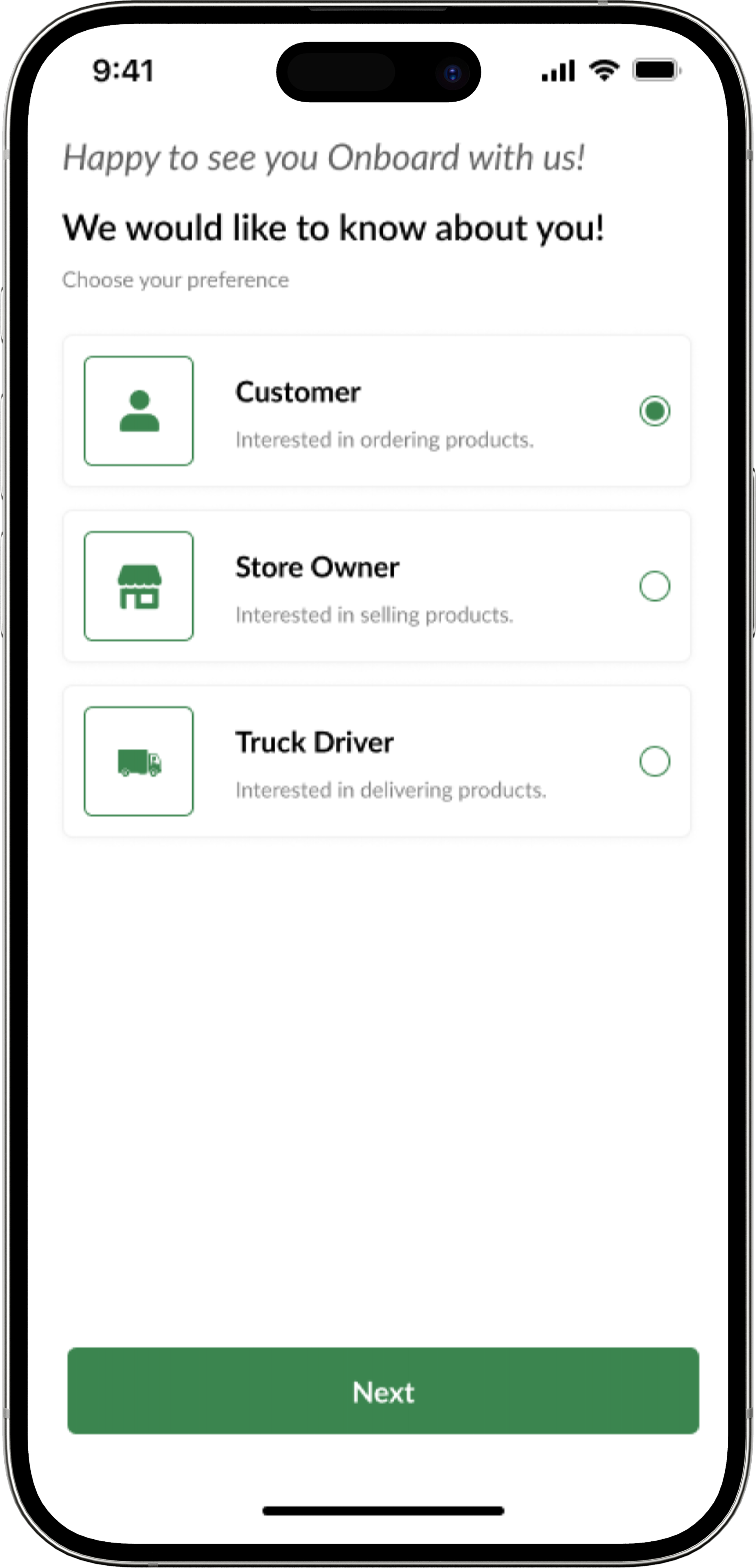
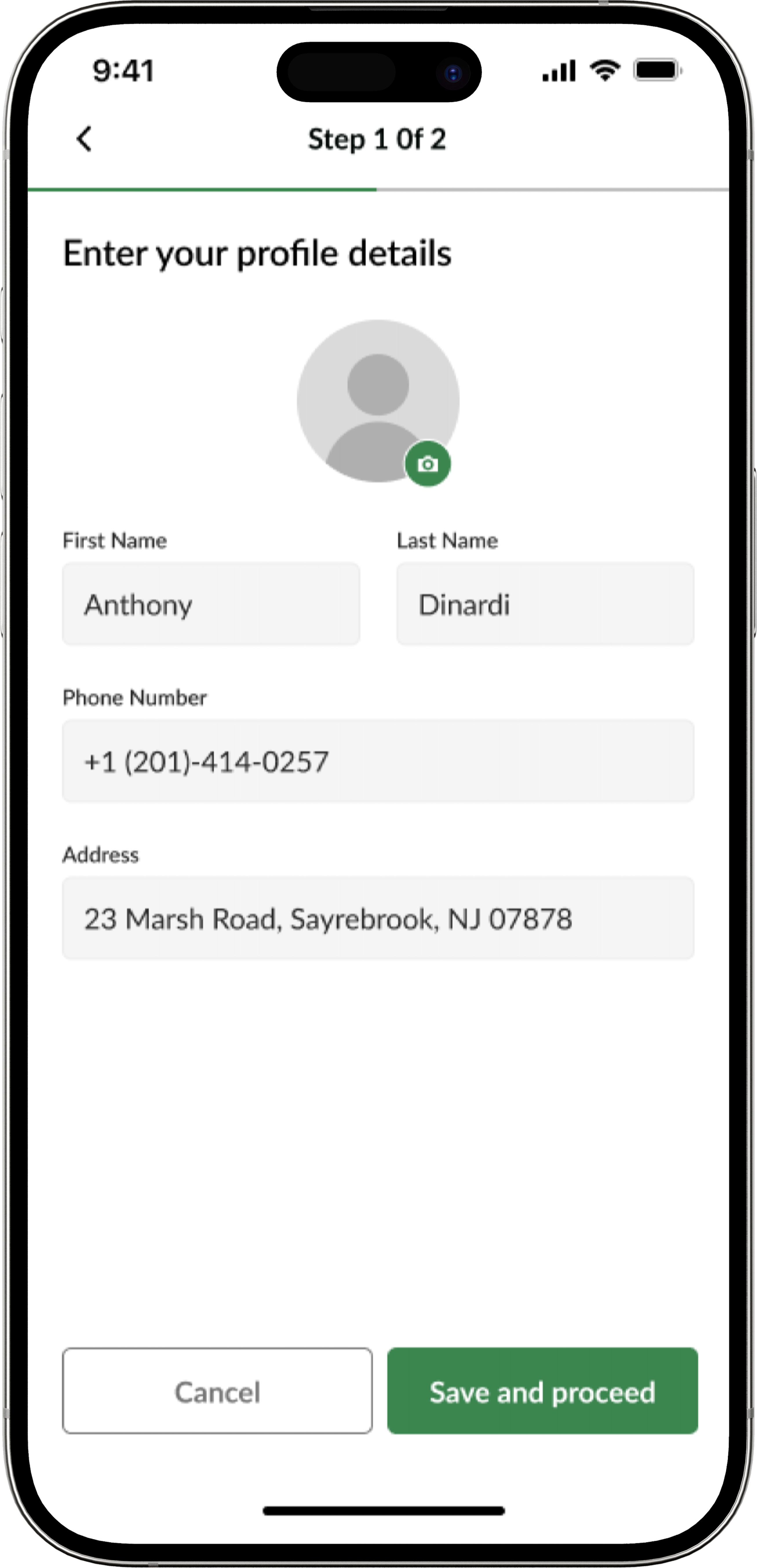
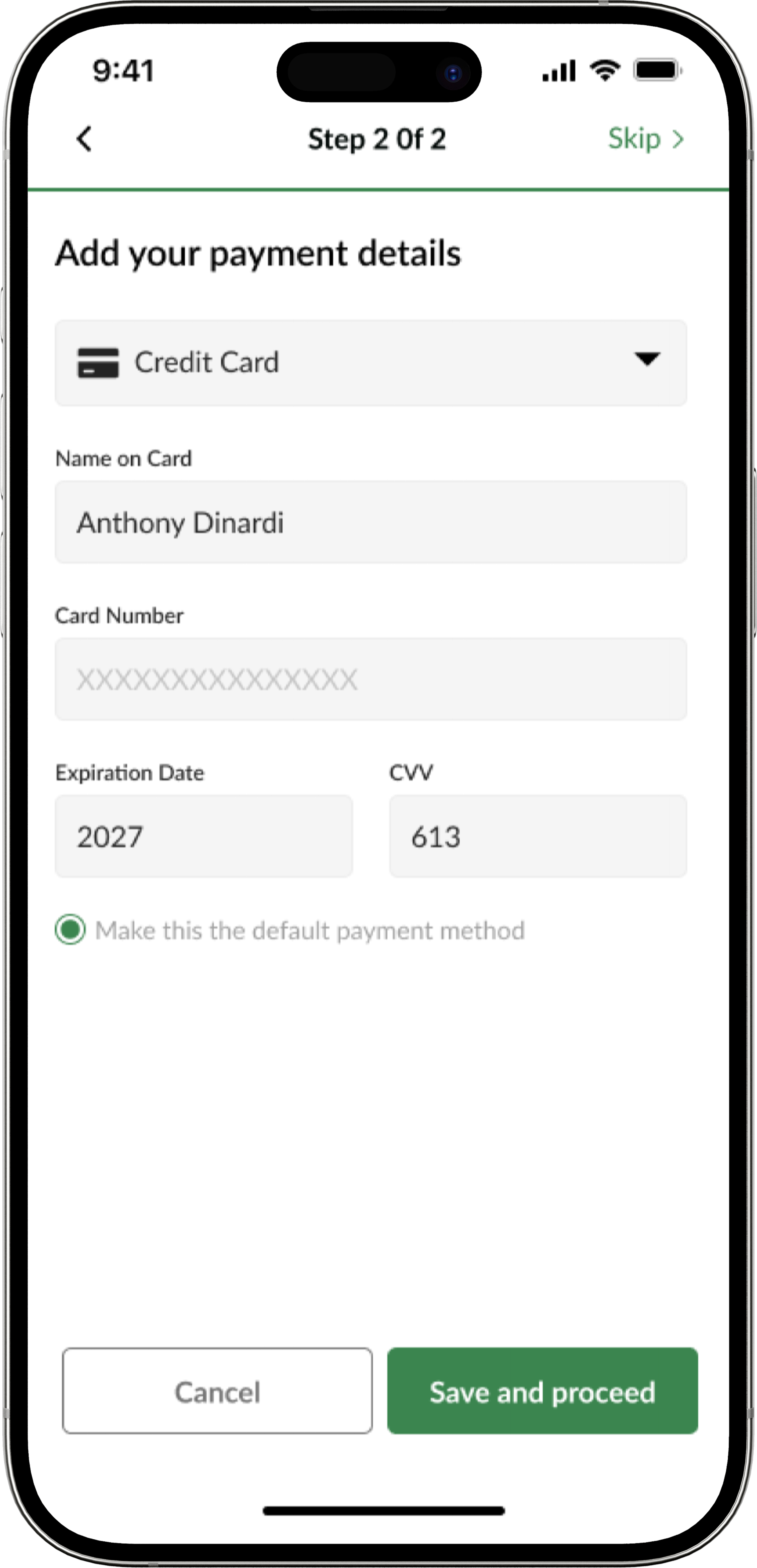
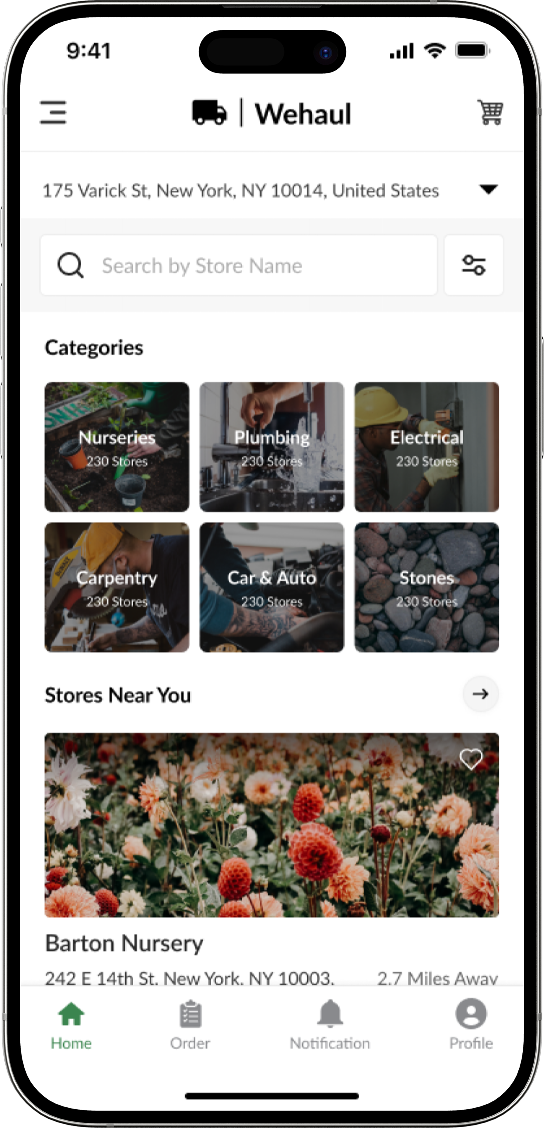
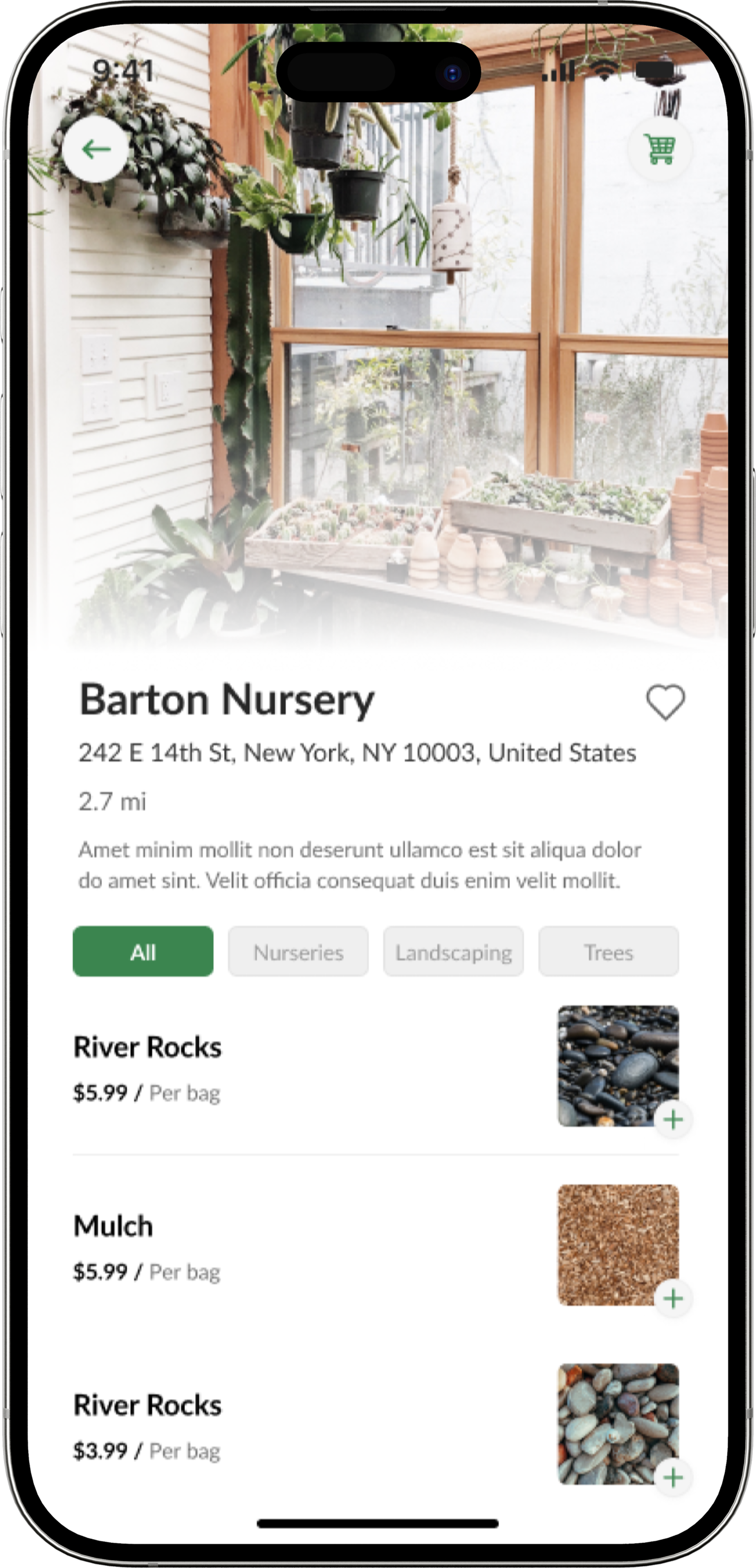
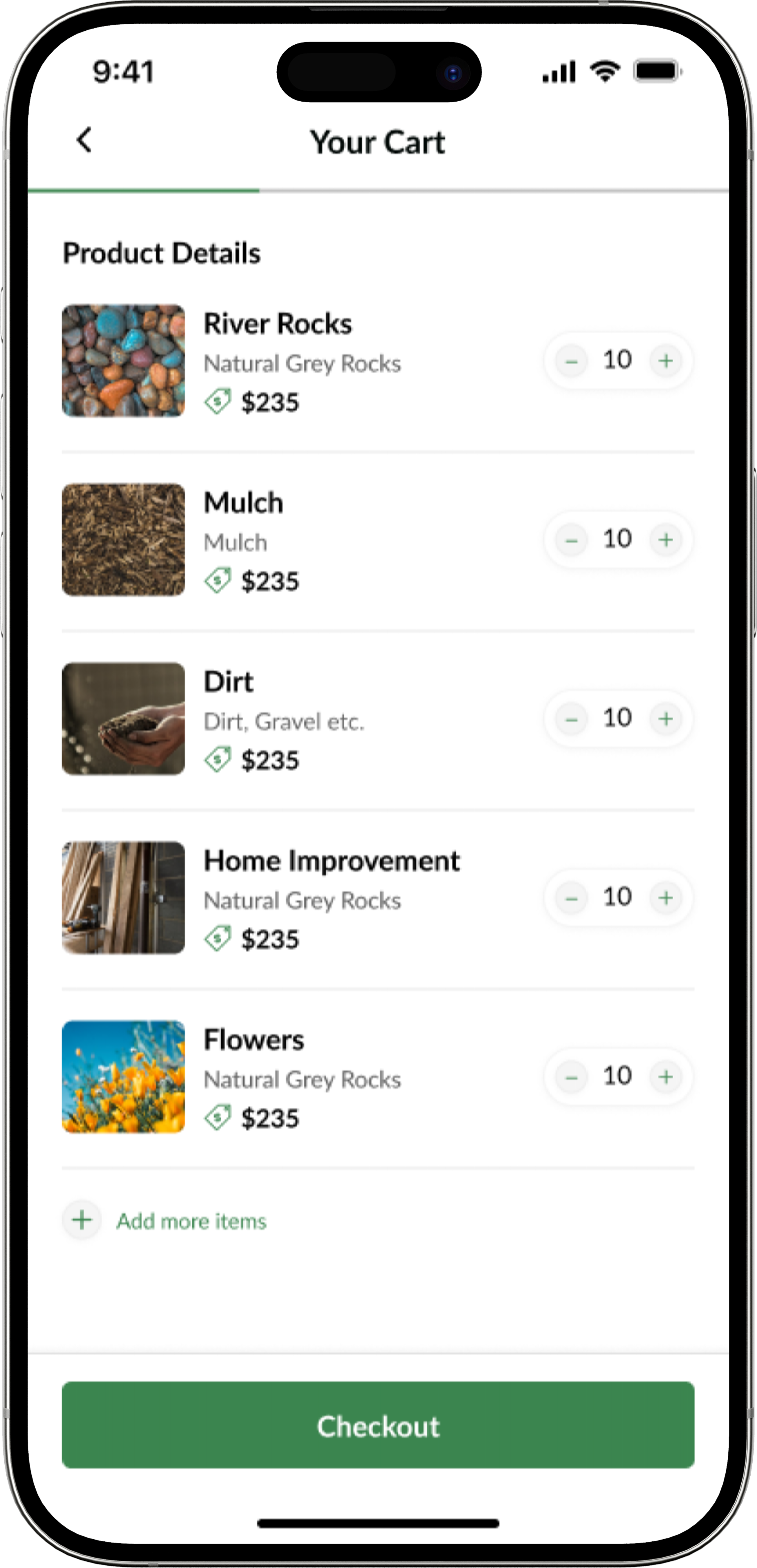
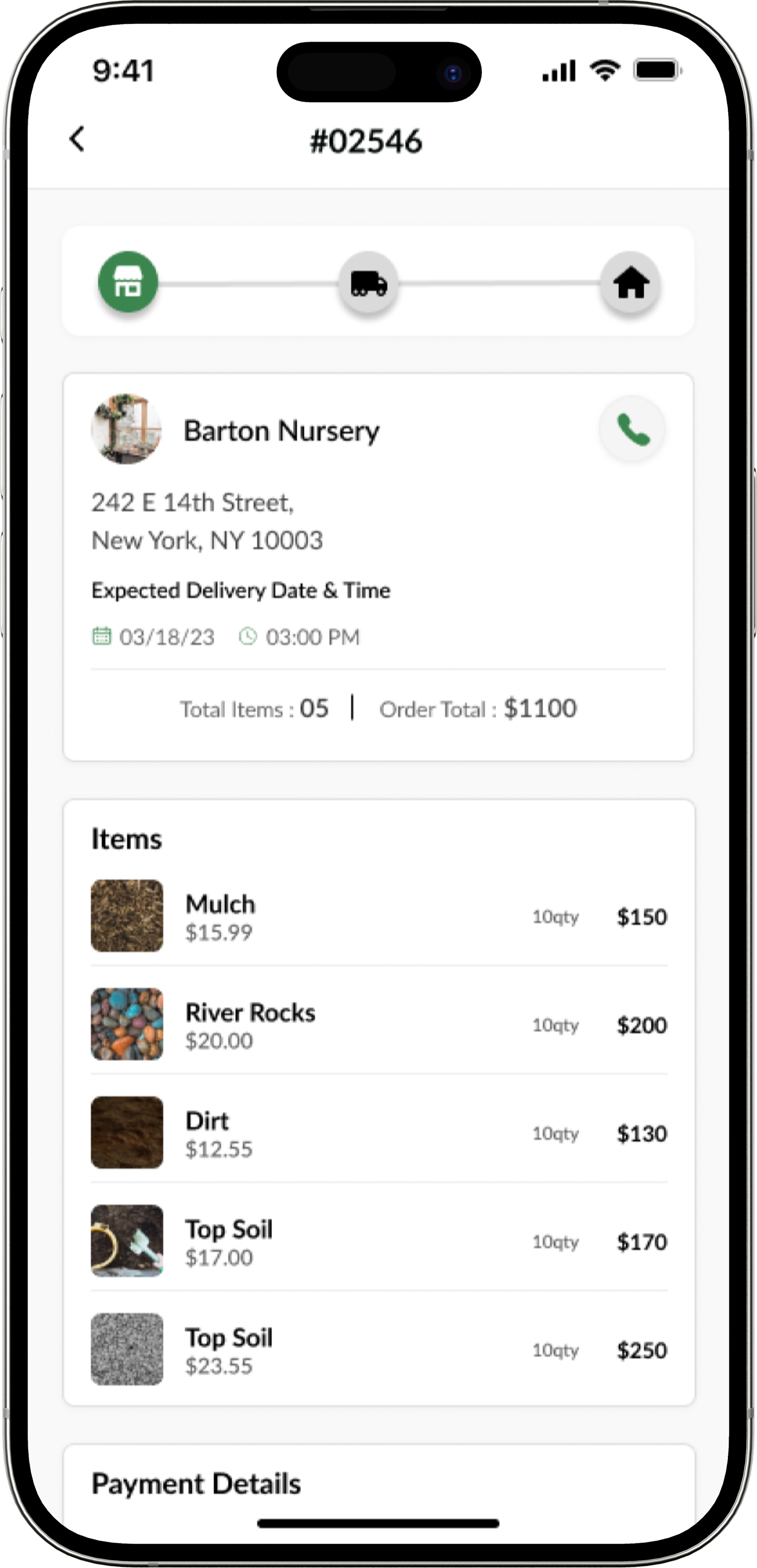
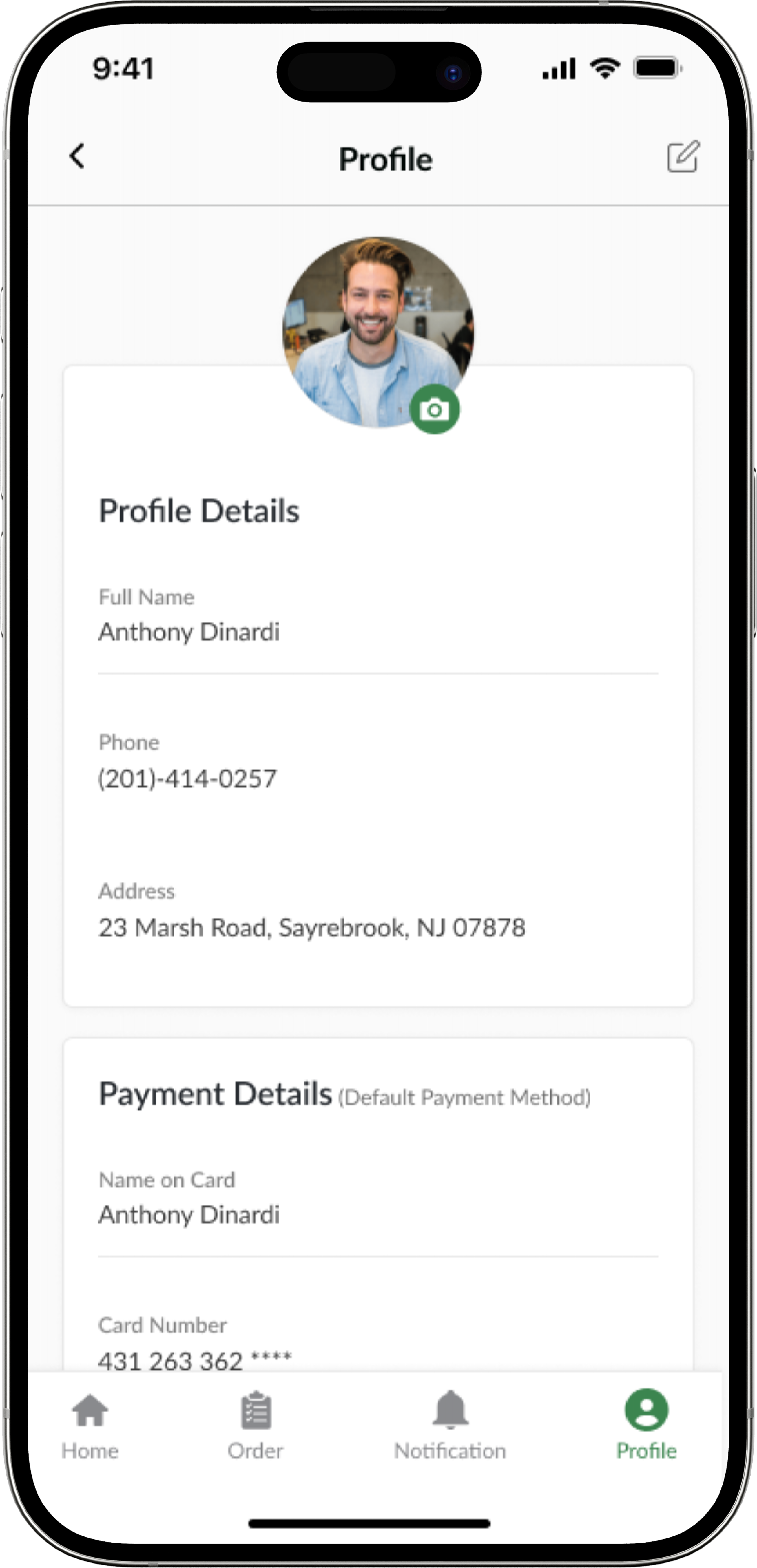
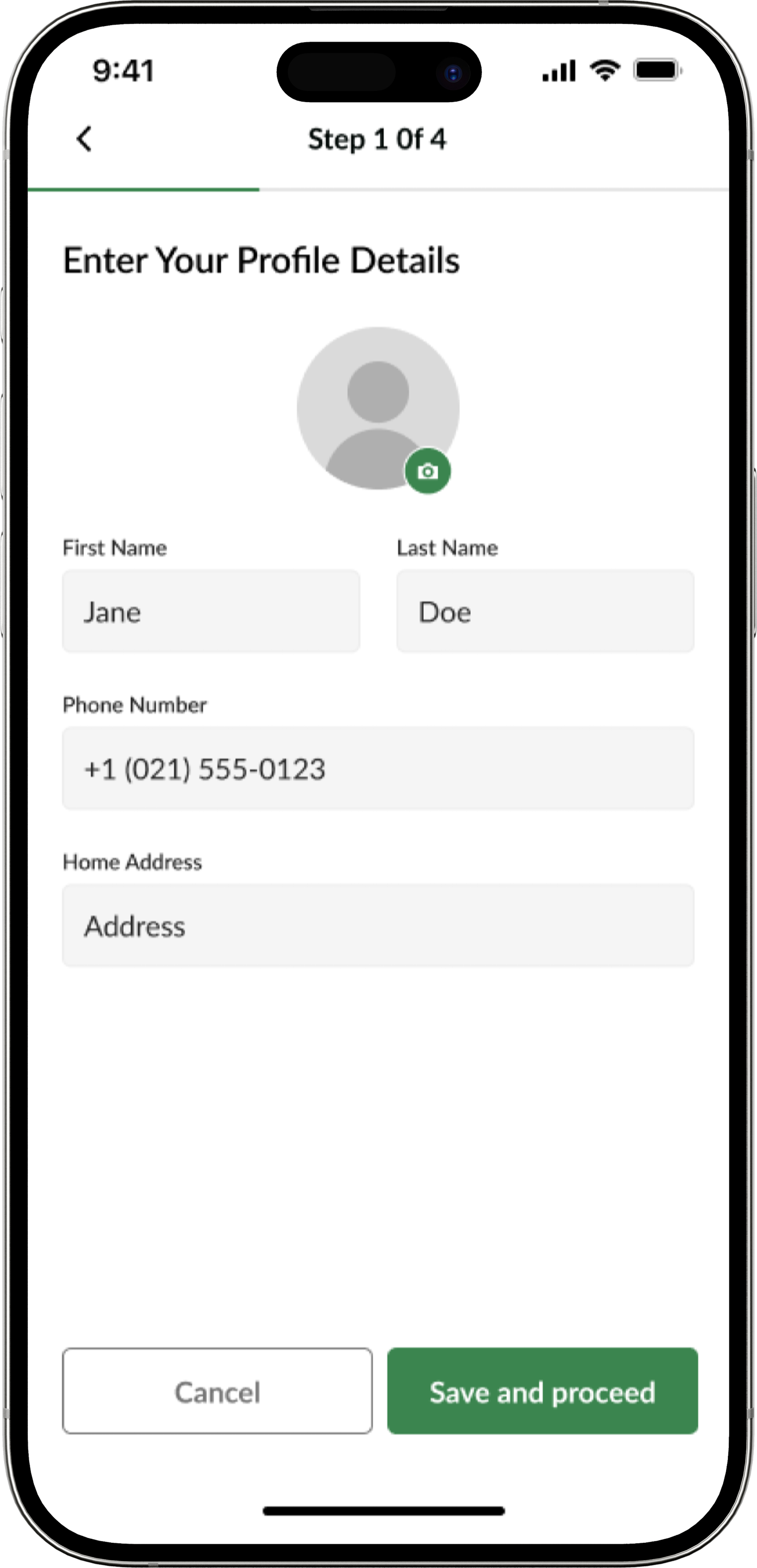
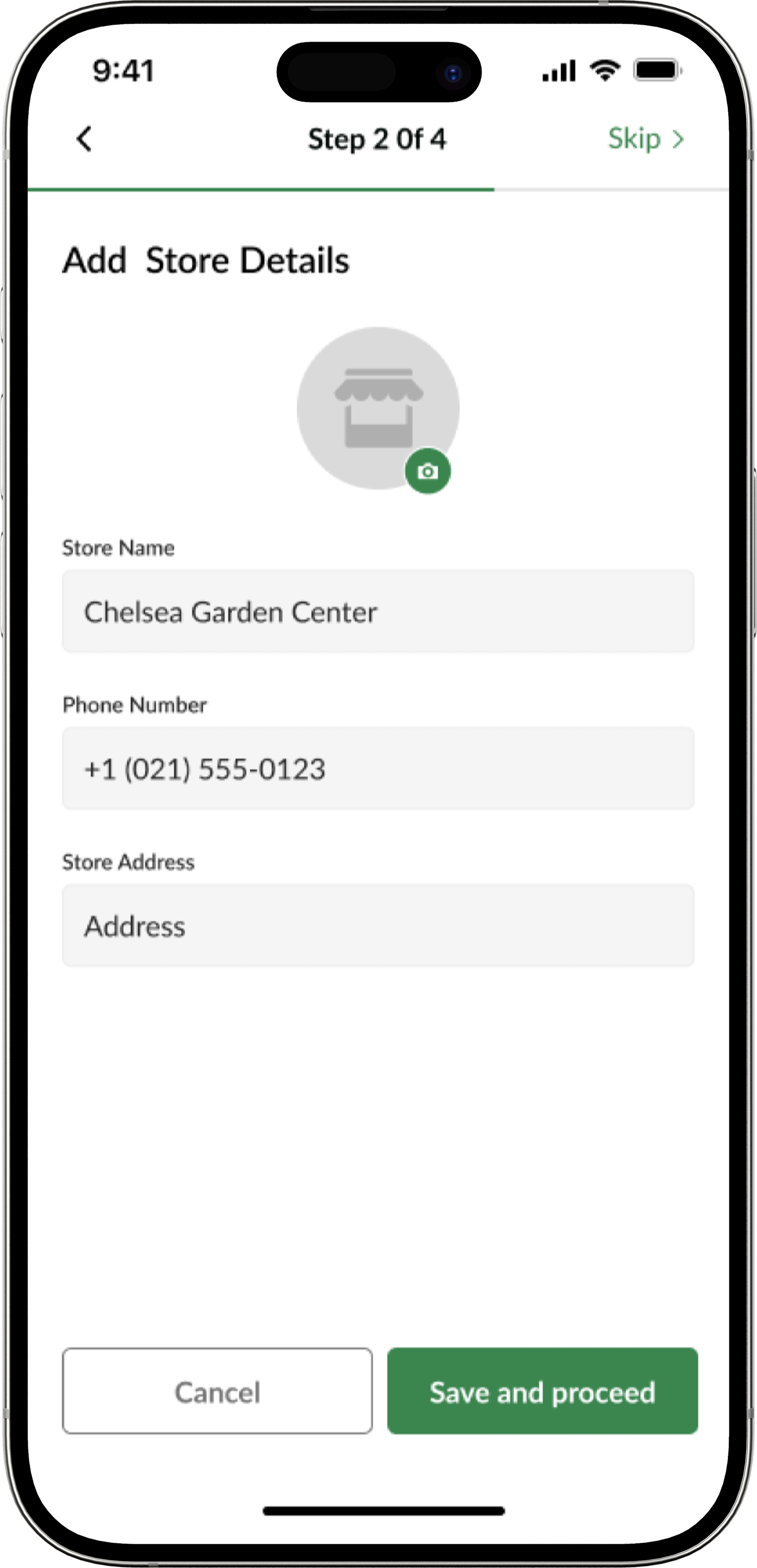
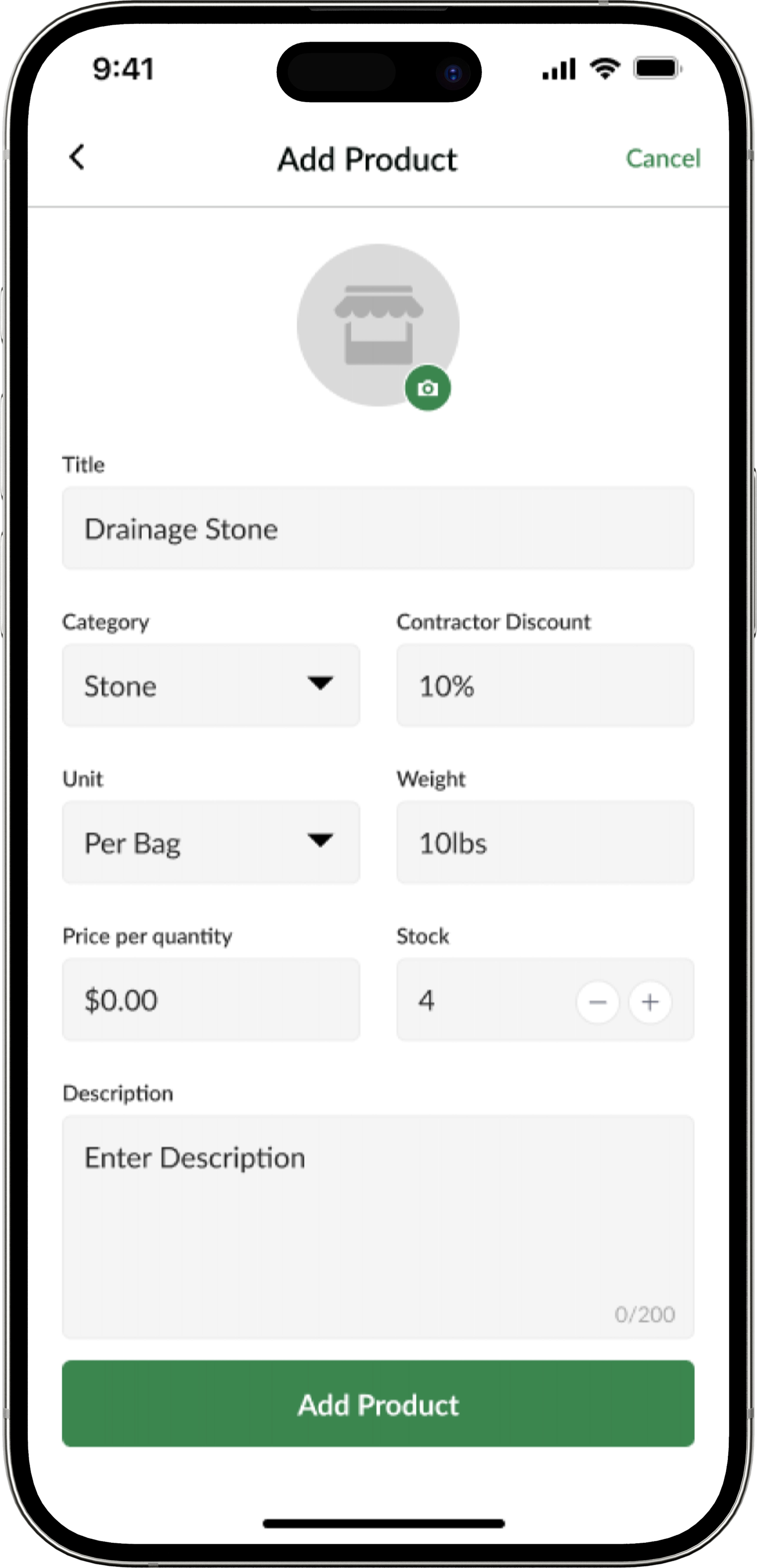
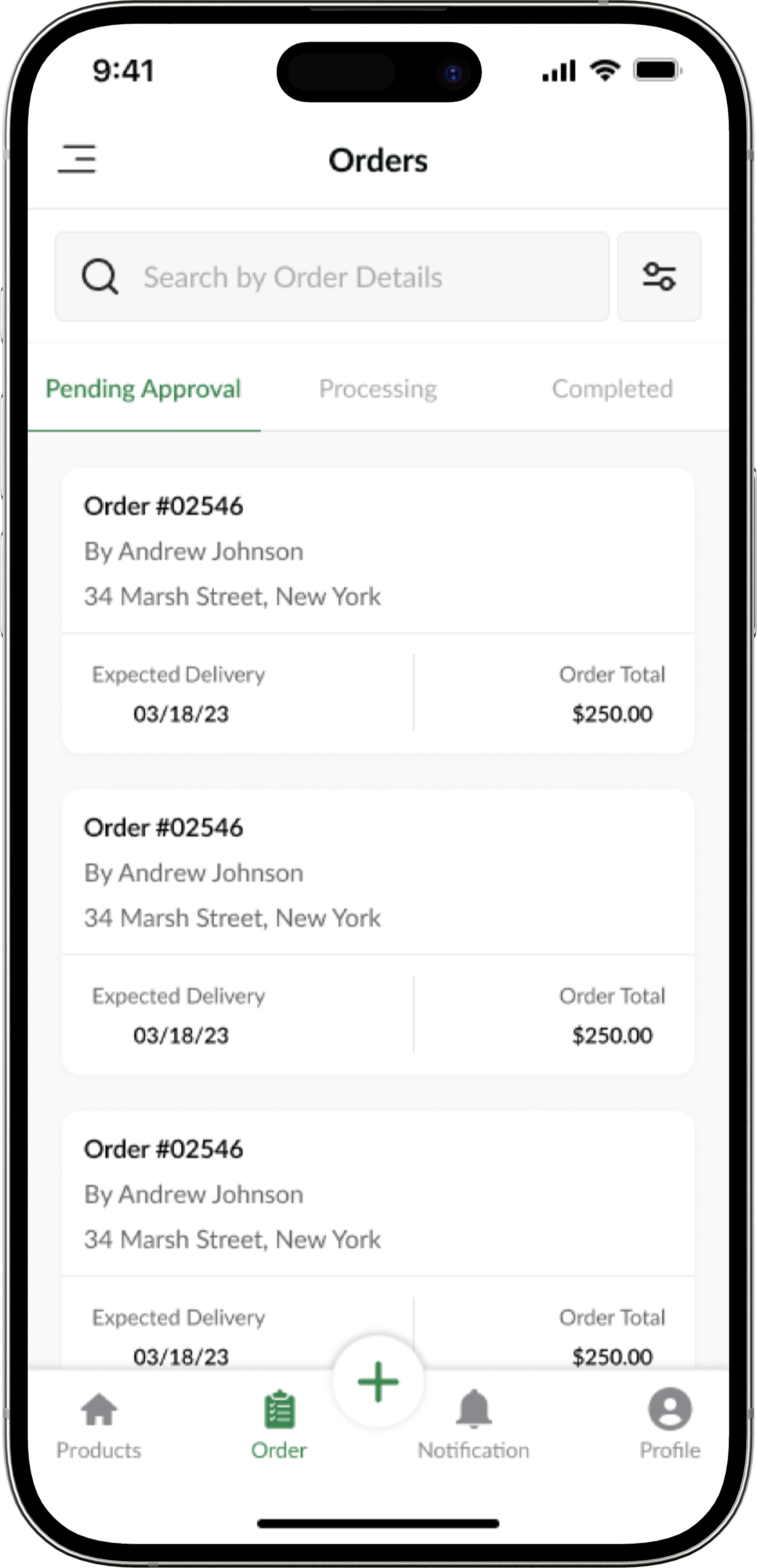
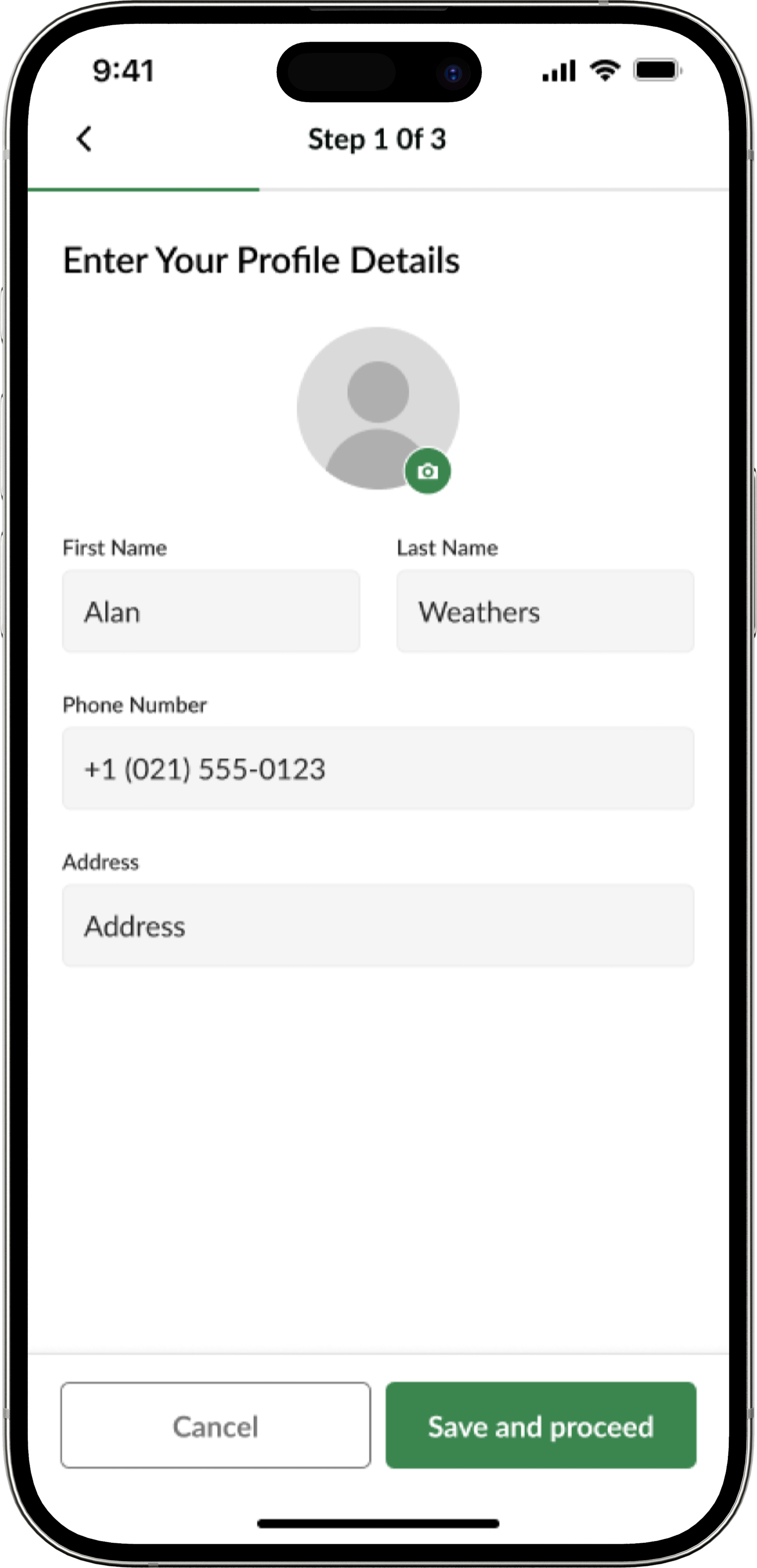
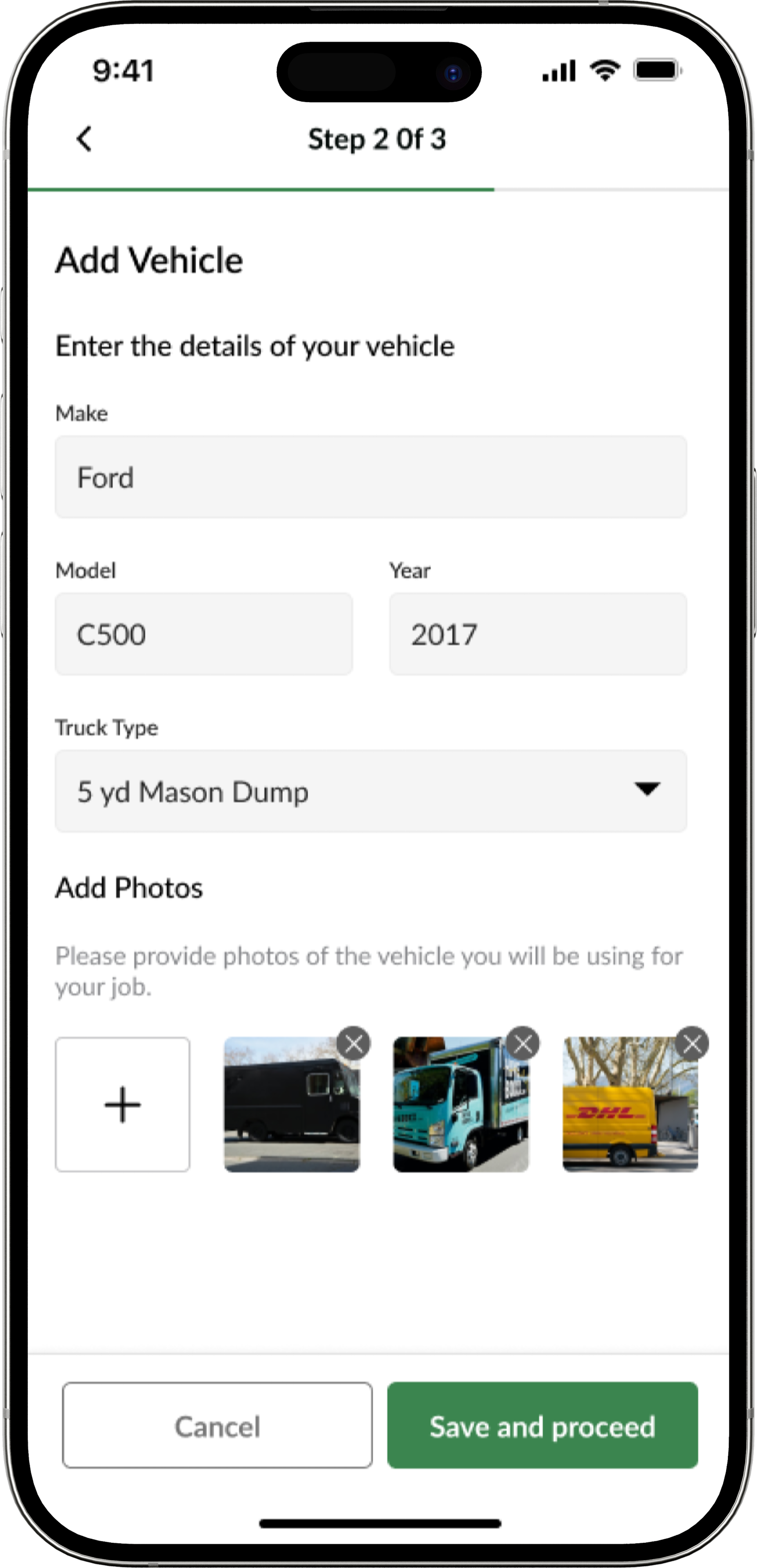
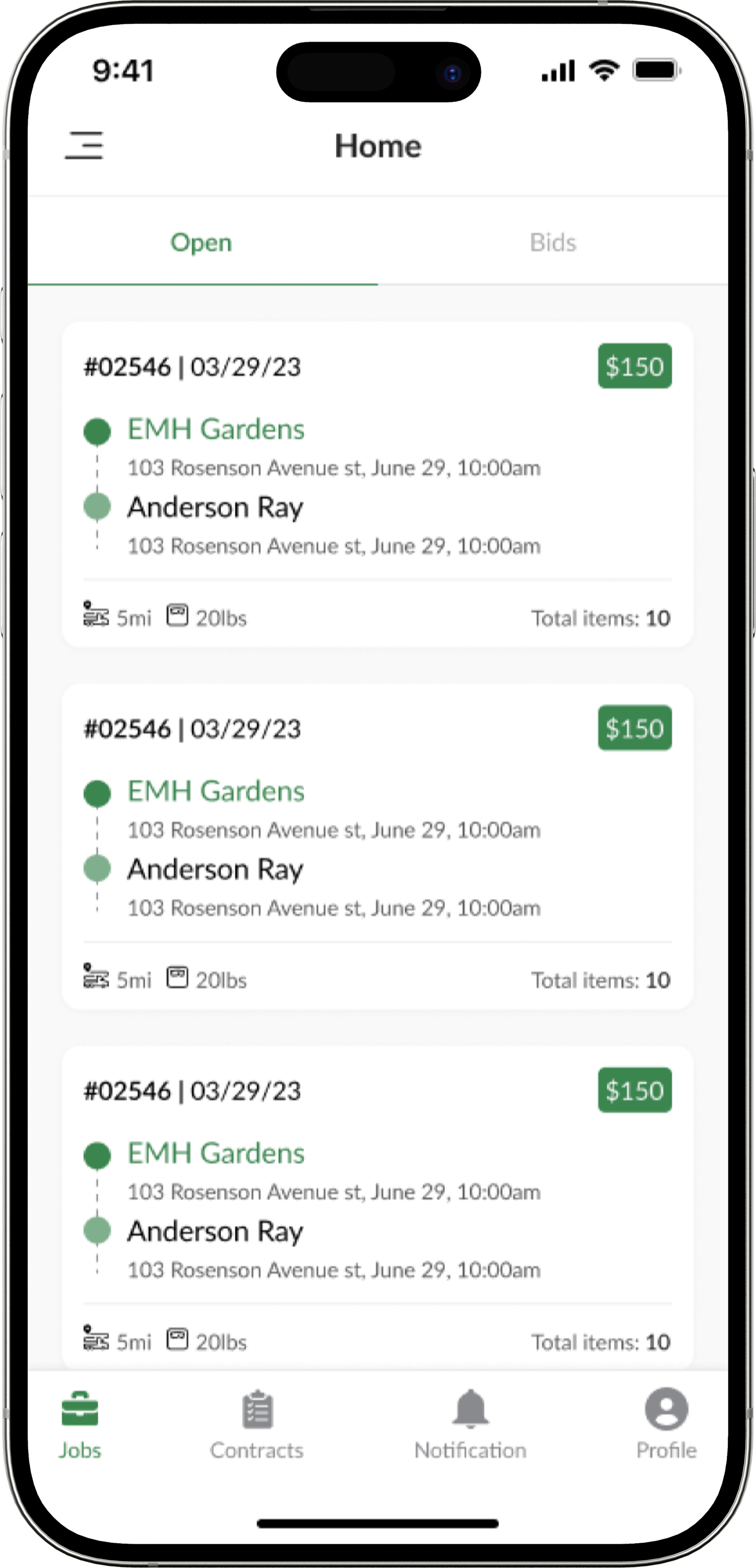
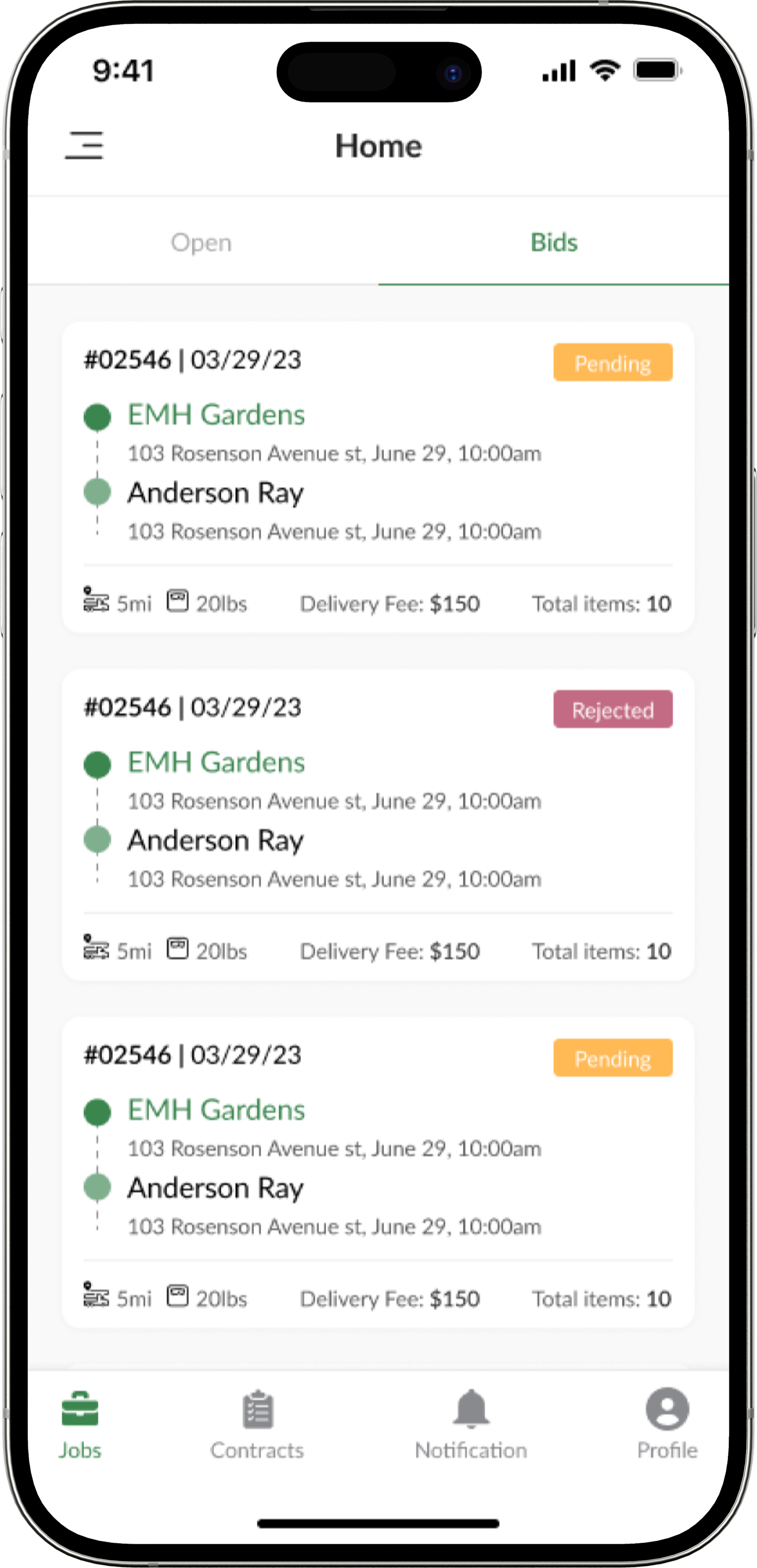
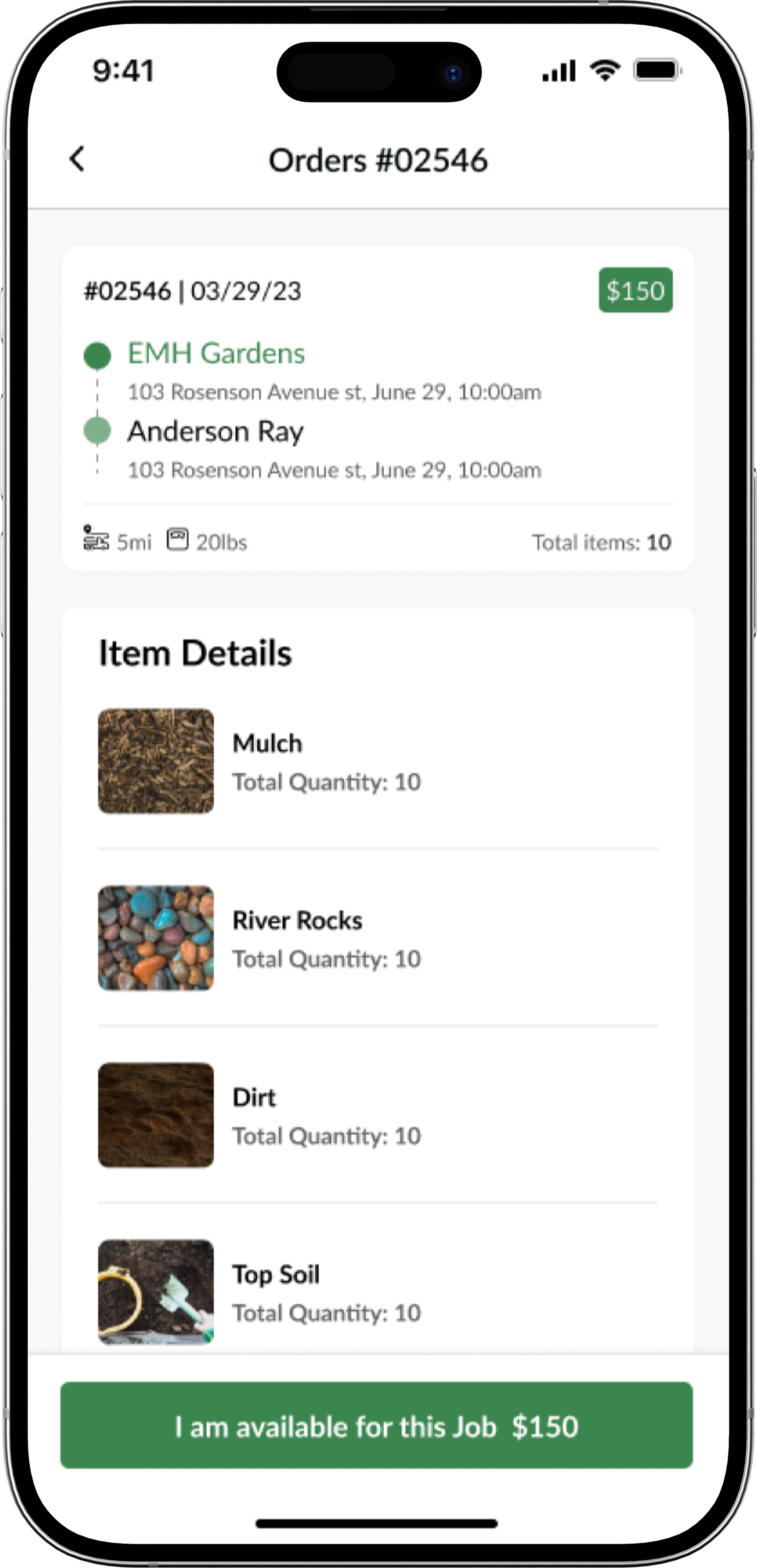
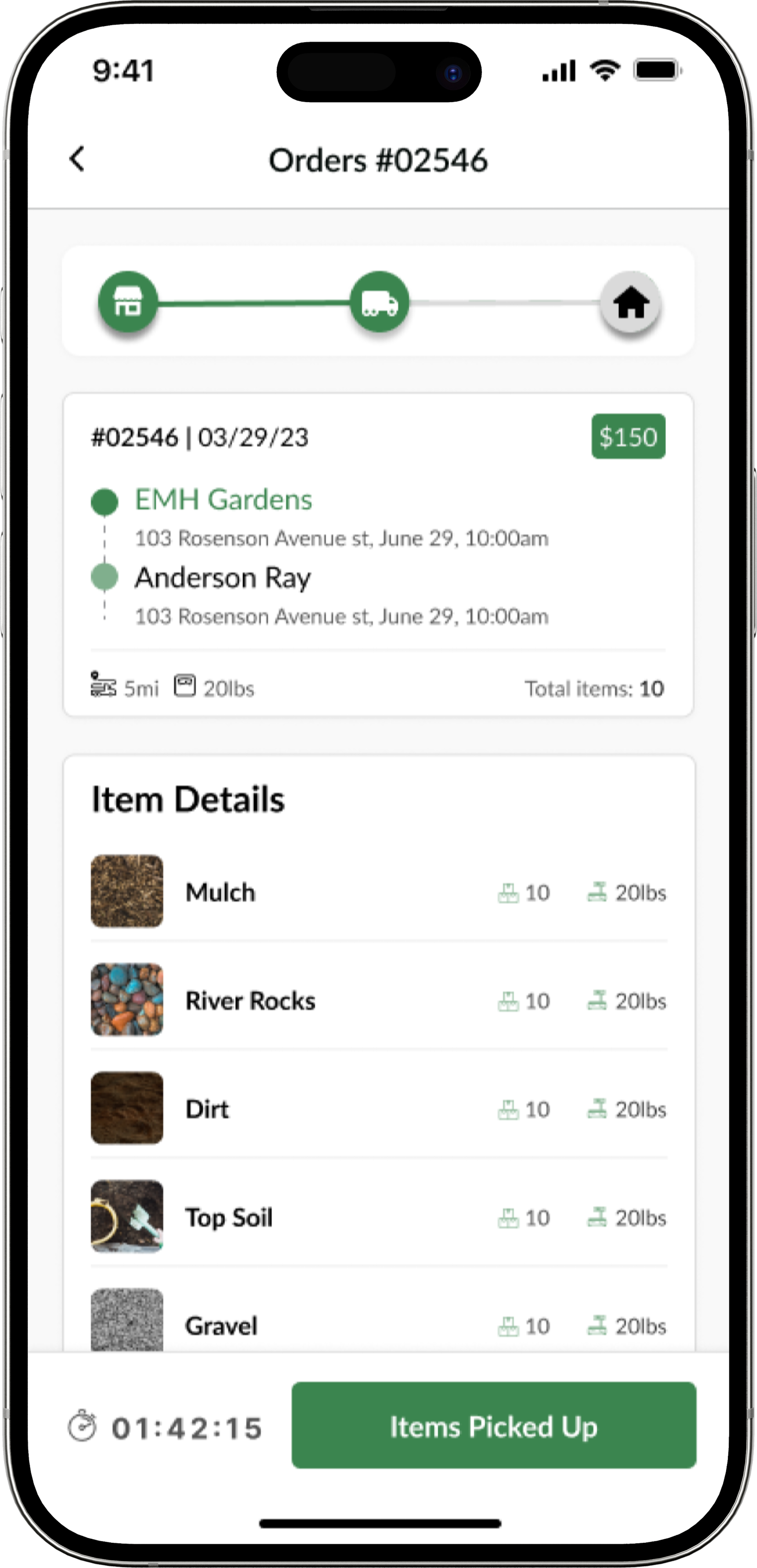
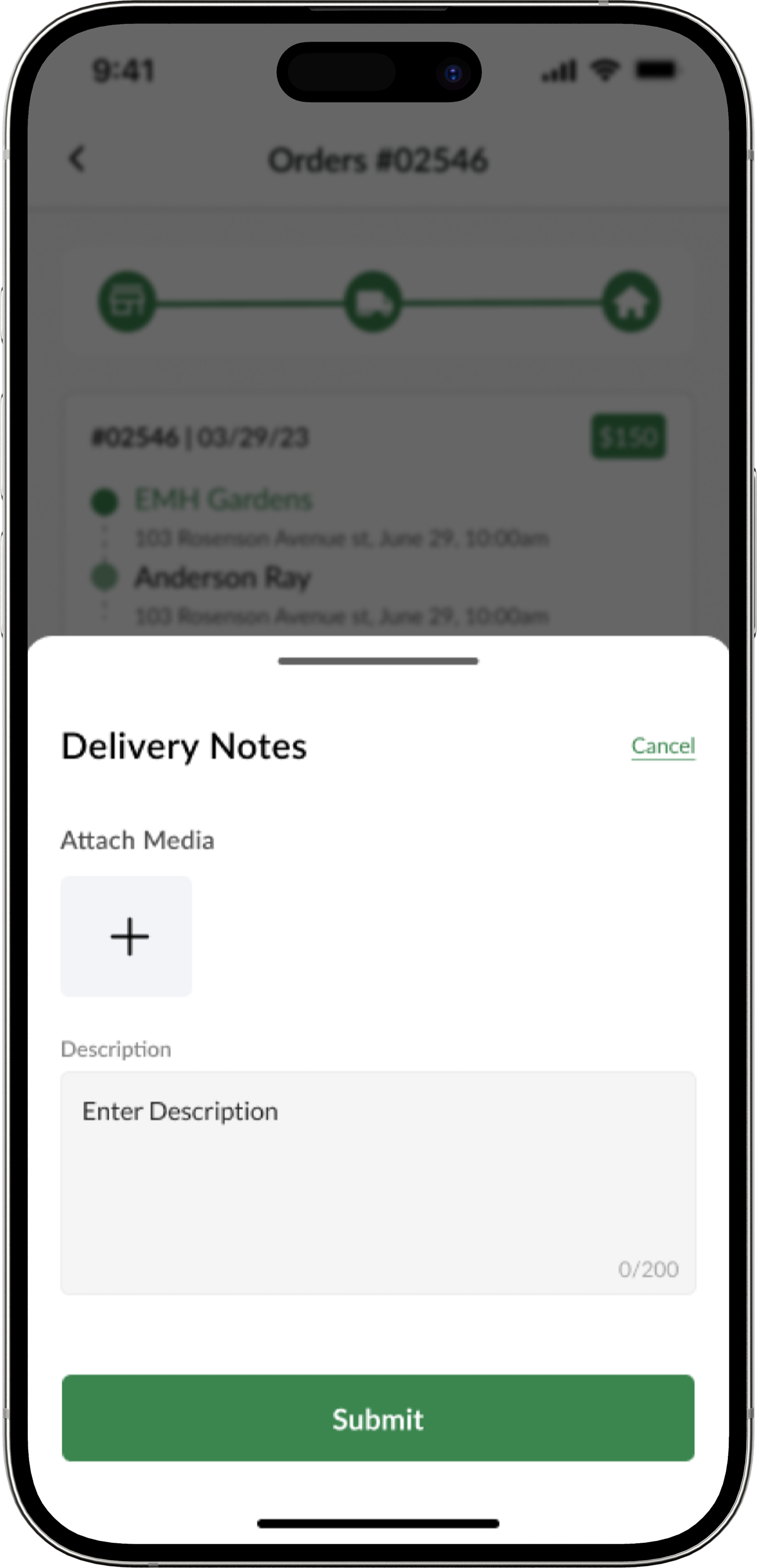
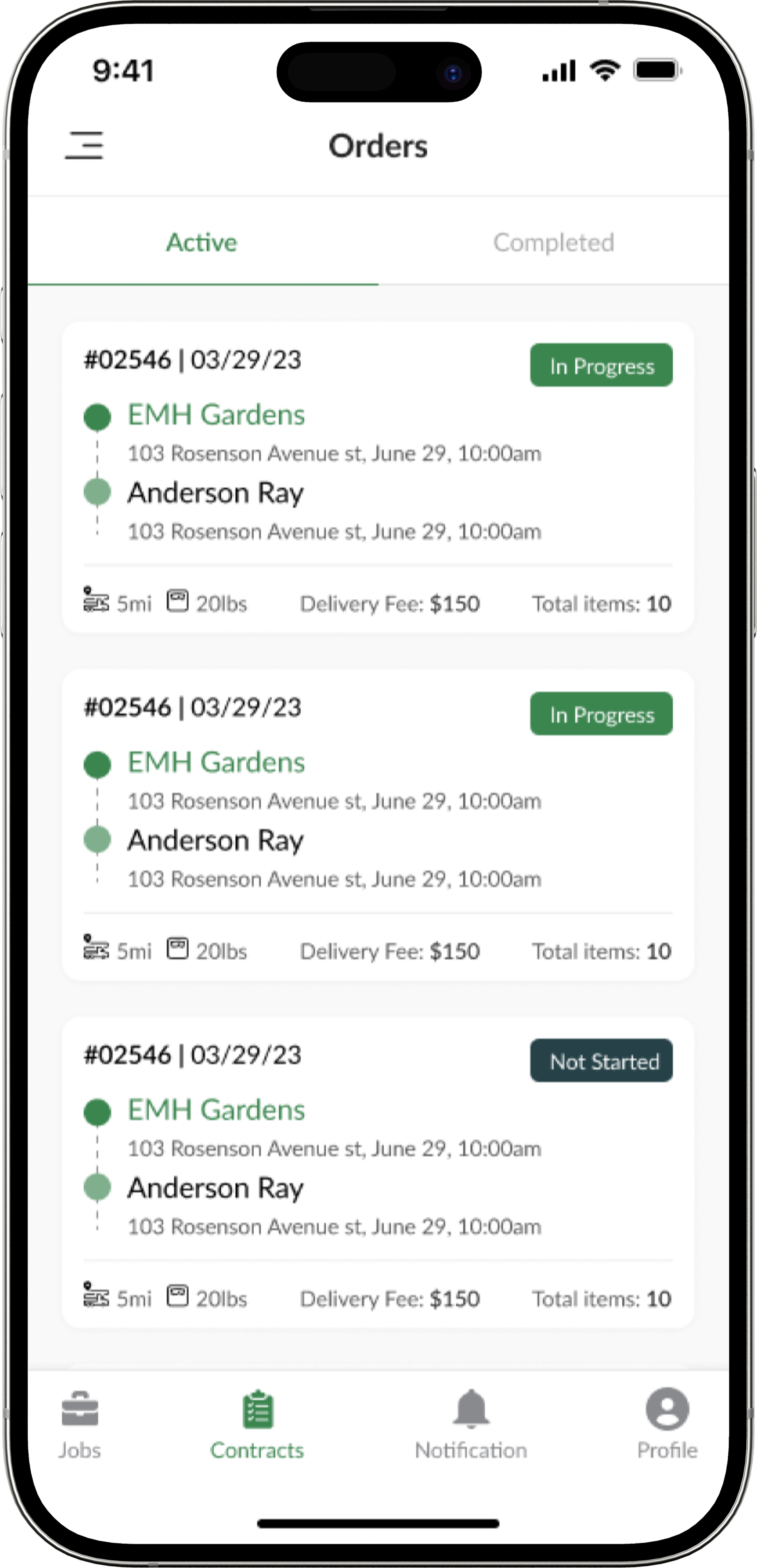
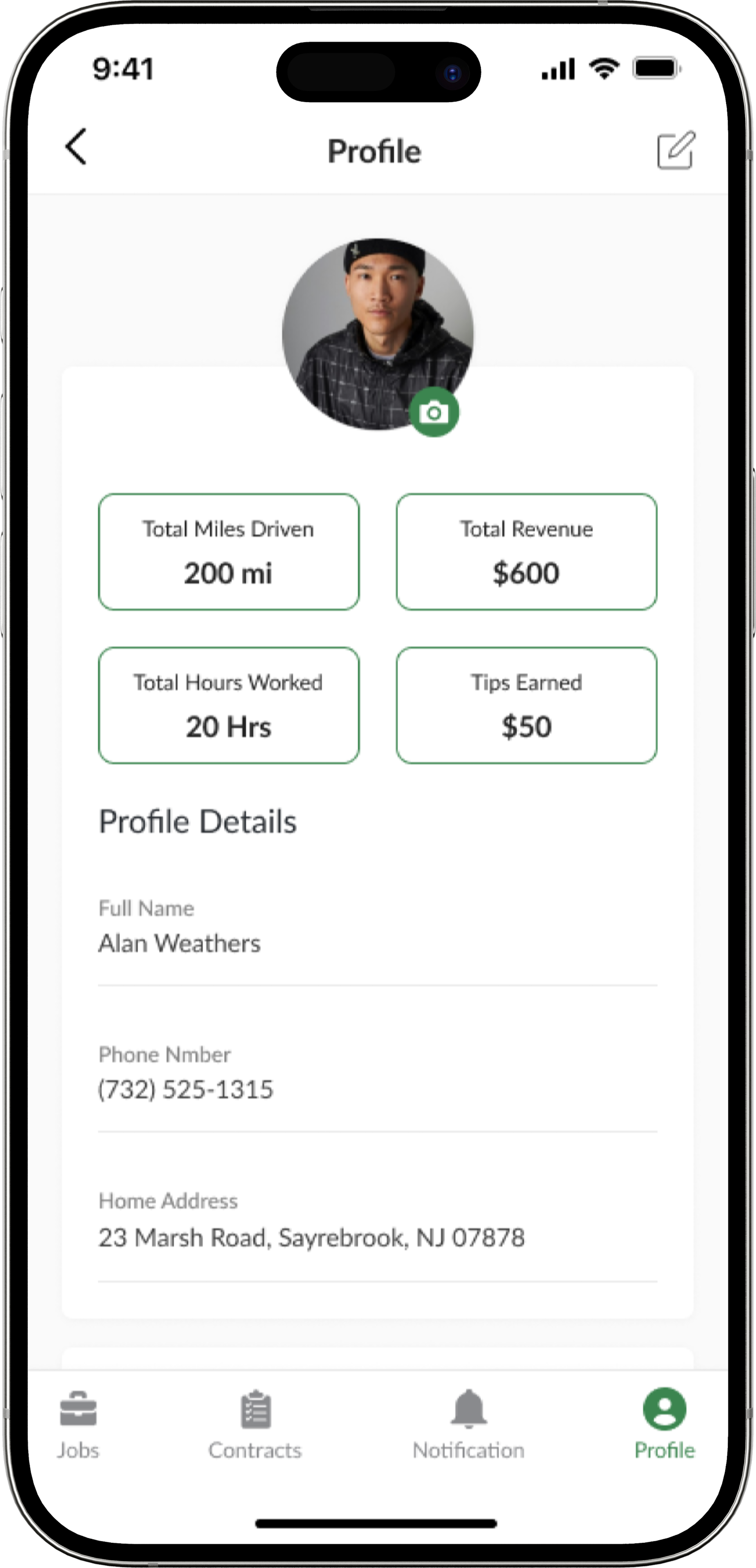
Once we finalized the screens and layout, I worked with the design team to create three different application versions for customers, storefront owners, and truck drivers.
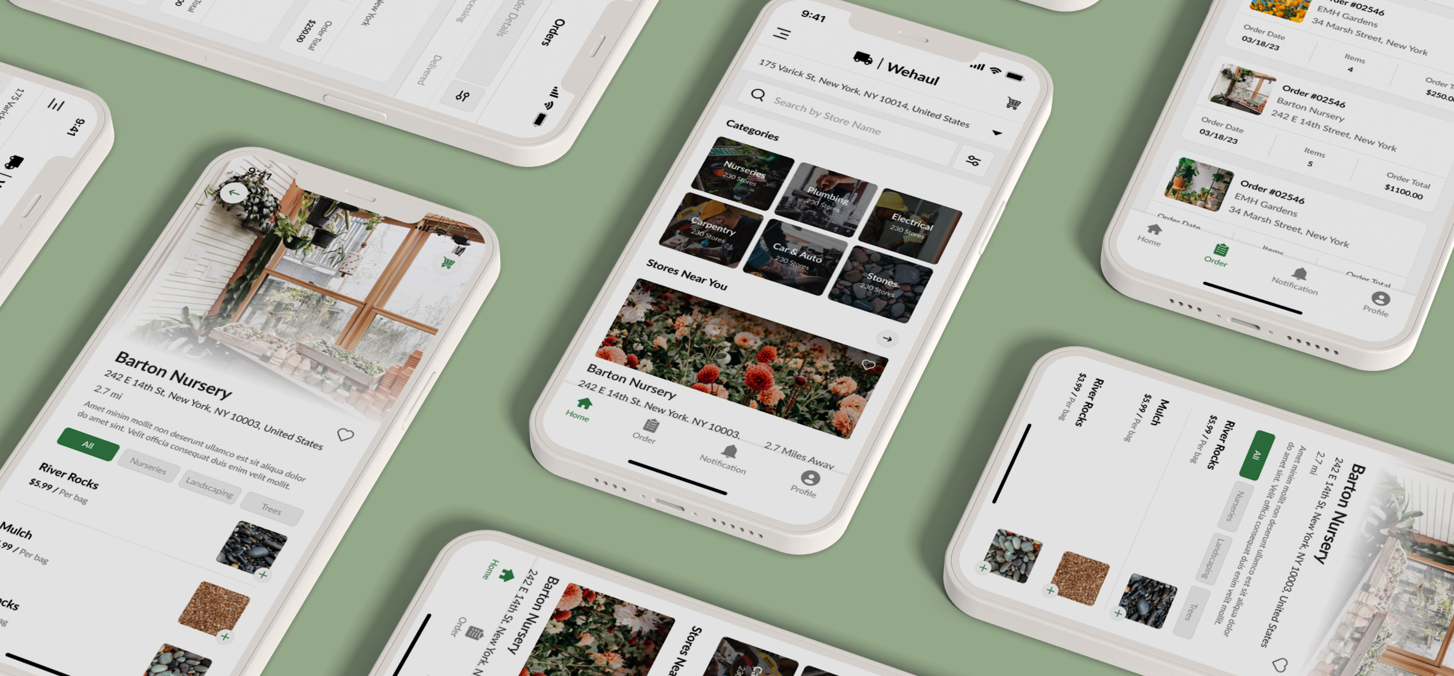
WeHaul aims to simplify the process of ordering and transporting landscaping materials by offering a user-friendly platform with features like instant or scheduled delivery options, real-time tracking, and in-app messaging for communication. WeHaul is also targeting to create a new market for landscaping businesses and enhance their customer base, optimizing the delivery process for homeowners and truck drivers.
With its emphasis on convenience, cost-effectiveness, and fostering a micro-economy in the trucking industry, WeHaul presents a promising solution to the challenges of material delivery in the landscaping sector.
Finalized Screens
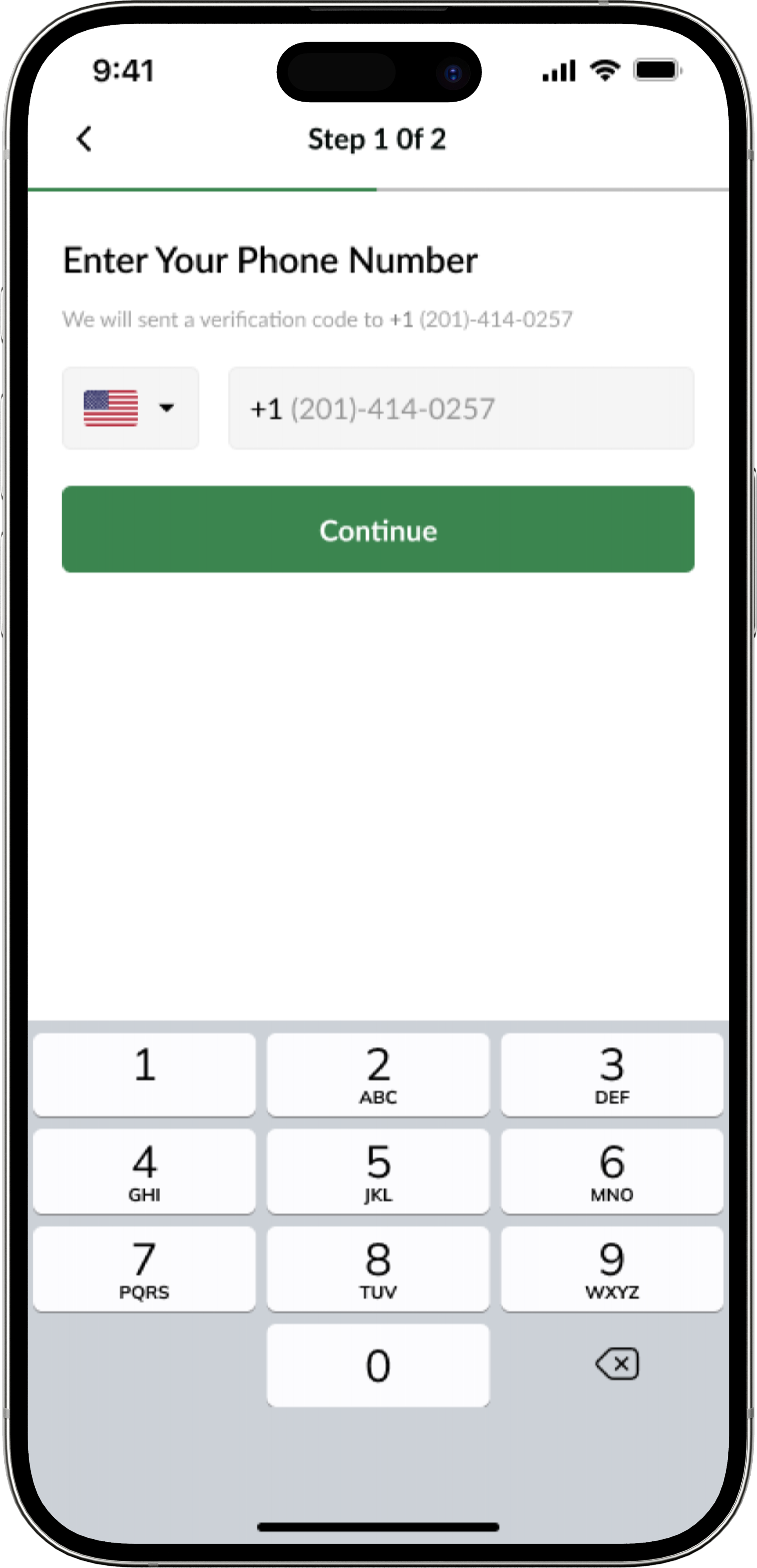
Customer Screens
Storeowner Screens
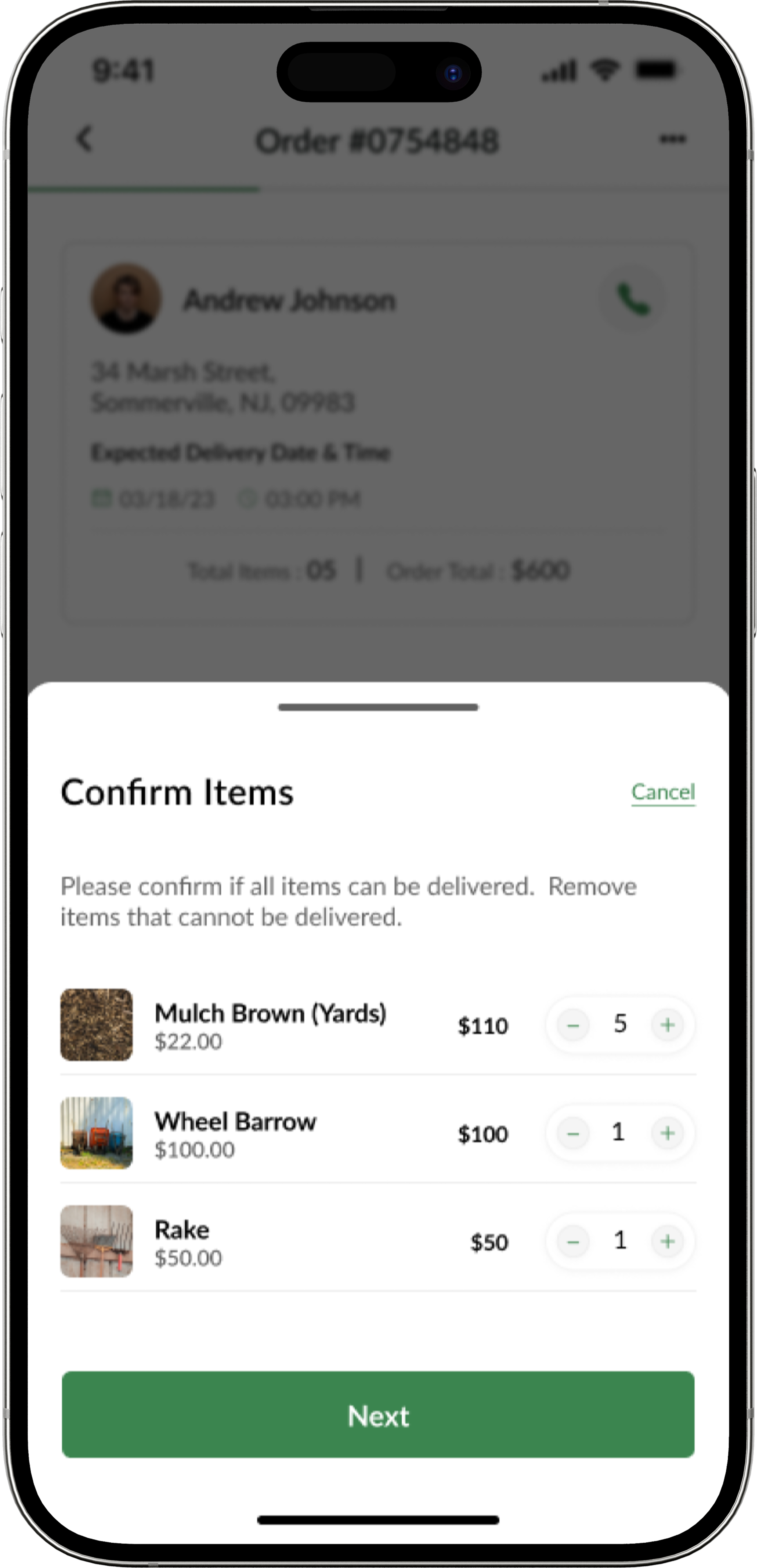
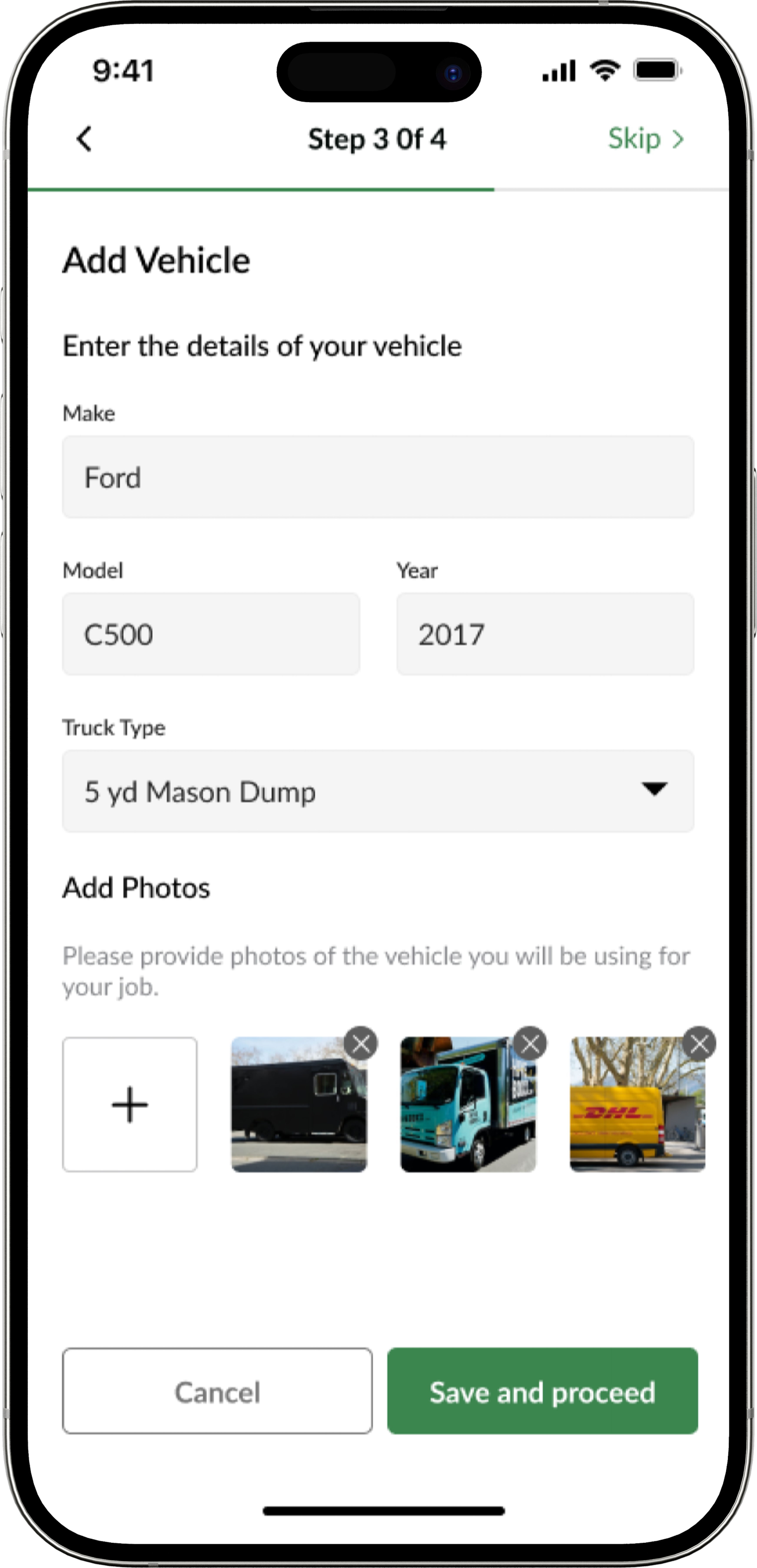
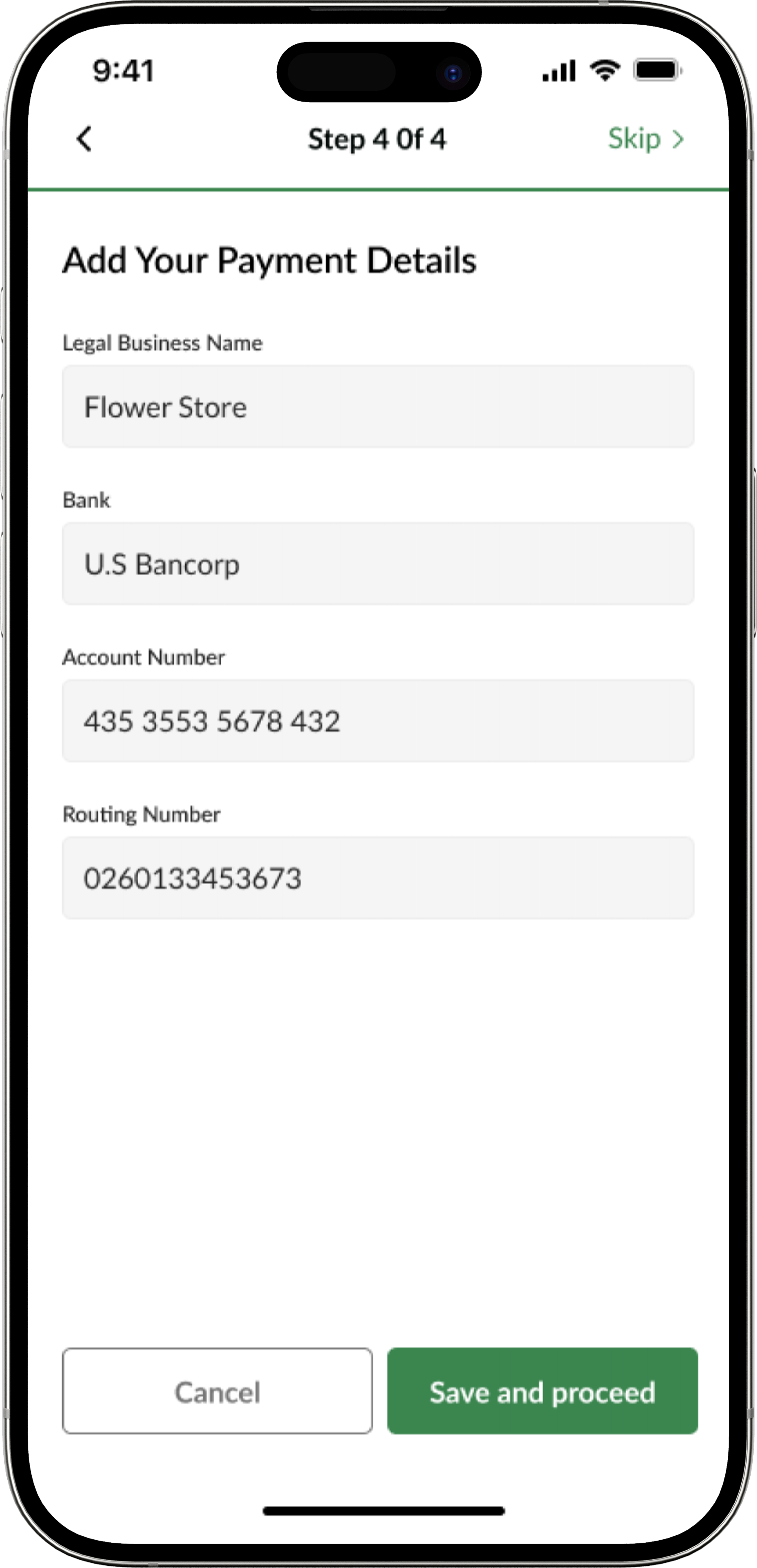
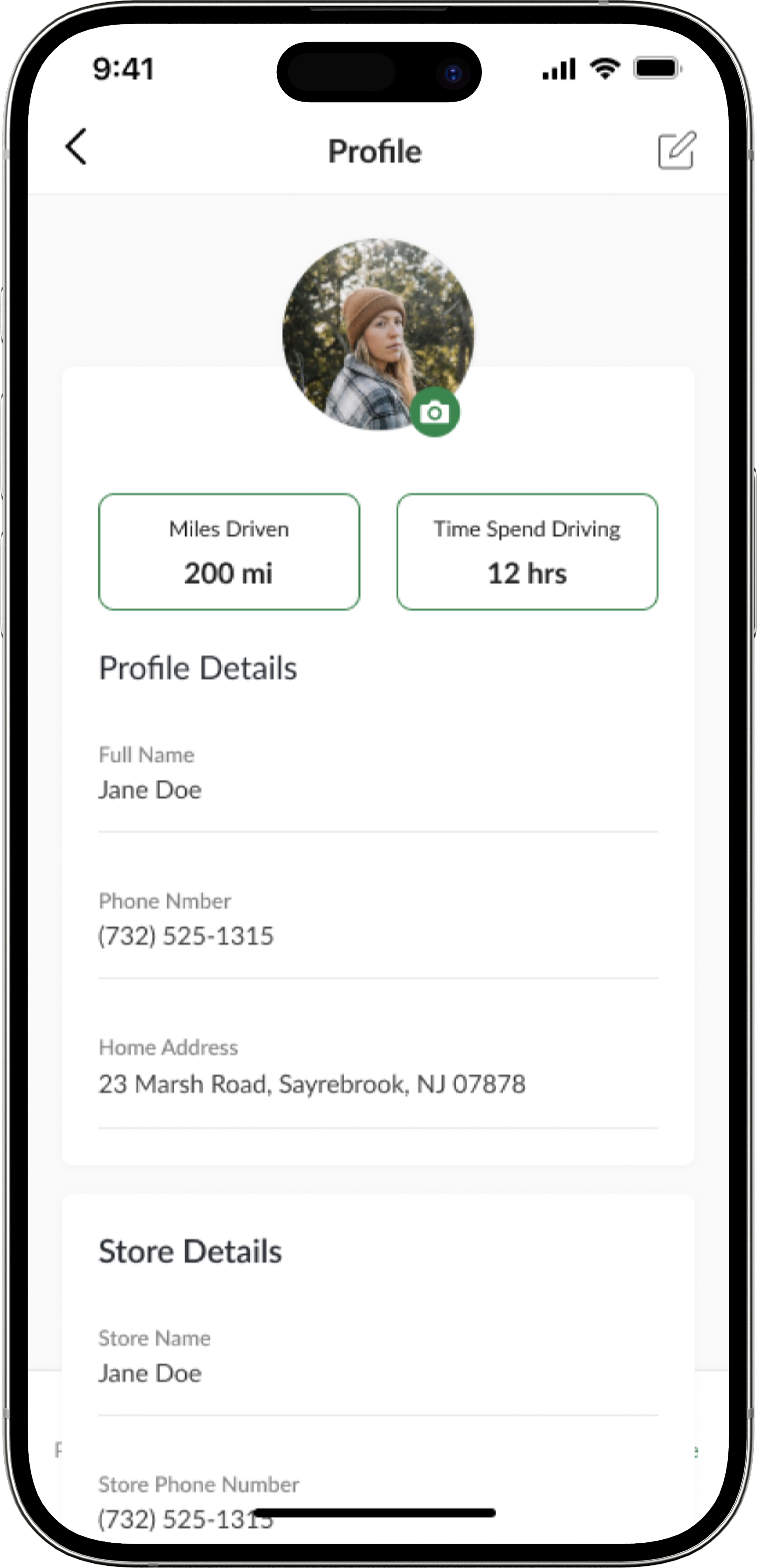
Truck Driver Screens
Project Outcome
Three tailored applications sharing one cohesive design language, connecting homeowners, nurseries, and truck drivers in a single marketplace.
Our team successfully delivered the client's completed design, brand identity, and mobile application mockup. We overcame the challenge of creating three different experiences while holding a cohesive design throughout the application.
What I took from this
Three applications can share one design language without pretending their users want the same things. Cohesion is a visual decision; fitness is a workflow decision.
Designing a marketplace means designing the incentive, not only the interface. Drivers needed a reason to compete for a job before any screen mattered.