Fusion Design System
Fusion Health's first design system: over 200 components, WCAG AA built in, and now rolling out across the product suite.
The Stakes
Nothing existed, so Fusion's screens were inconsistent and many failed accessibility standards.
Several components and screens failed multiple WCAG standards, and many didn't make sense in clinical settings. WCAG AA became the push: the company needed to enforce compliance to avoid penalties.
What I Owned
I designed the system and owned how faithfully it made it from Figma to code.
I built the tokens and over 200 components, with variants and states, in Figma, and wrote the documentation and accessibility guidelines. Then I worked alongside three engineers to implement everything as a component library in Storybook.
A Neutral Base, So Errors Stand Out
Color was everywhere and carried no meaning, so what actually needed attention, like errors and conflicts, didn't stand out.
I built a neutral, WCAG AA-compliant base that handles the same workflows and functions, so a divergence like an error naturally draws attention. Meeting contrast standards and restoring clinical clarity came from the same decision.
Same workflow, new foundation
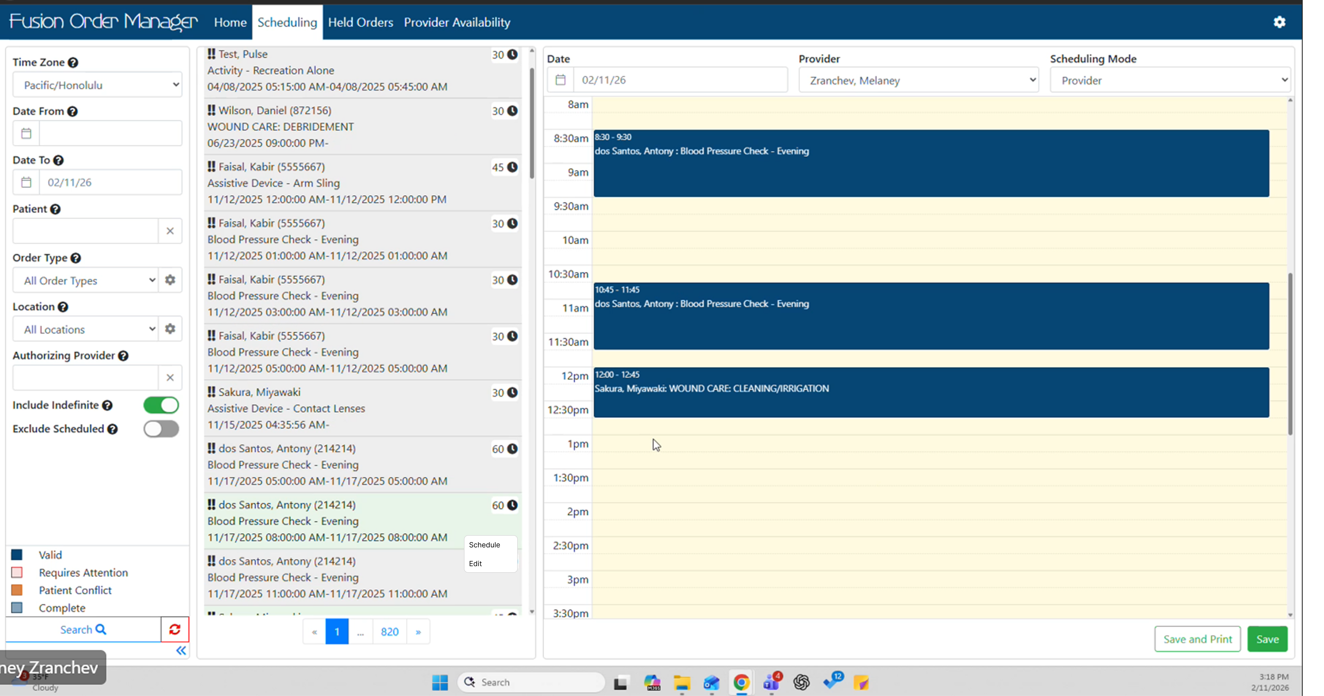
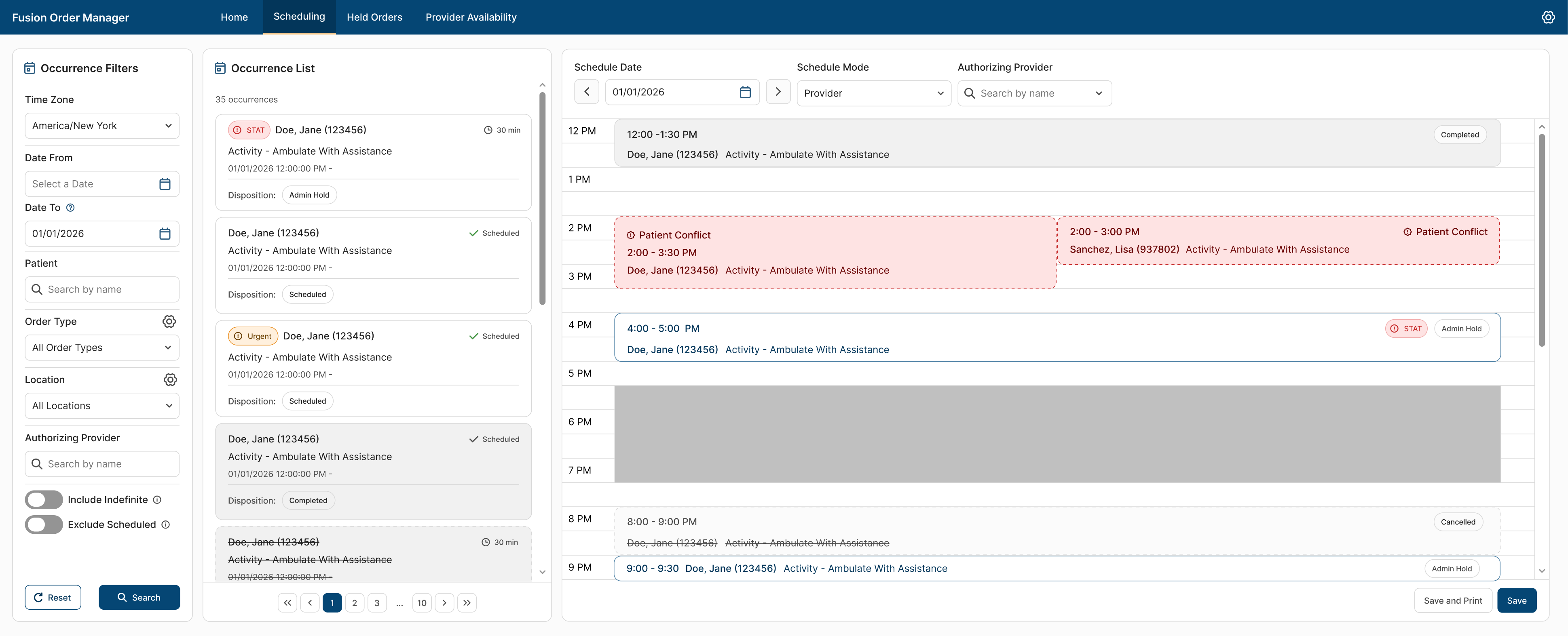
Before: the original scheduling screen, with dated, inconsistent styling. After: the same screen on the Fusion Design System. A neutral, consistent base means the only red left on screen is what needs attention: patient conflicts and STAT orders.
Tokens, Components, and Guidelines
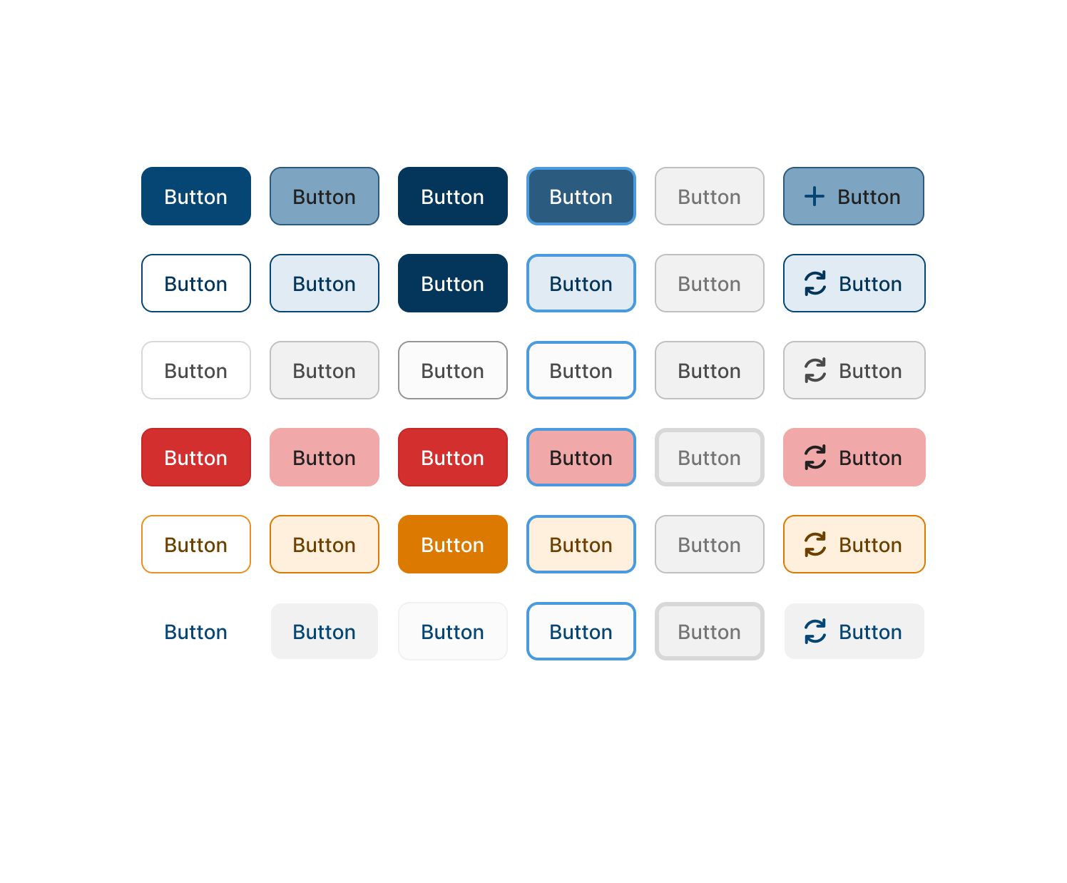
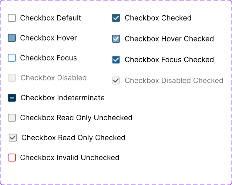
The first release shipped over 200 components with variants and states, along with tokens, documentation, and accessibility guidelines.
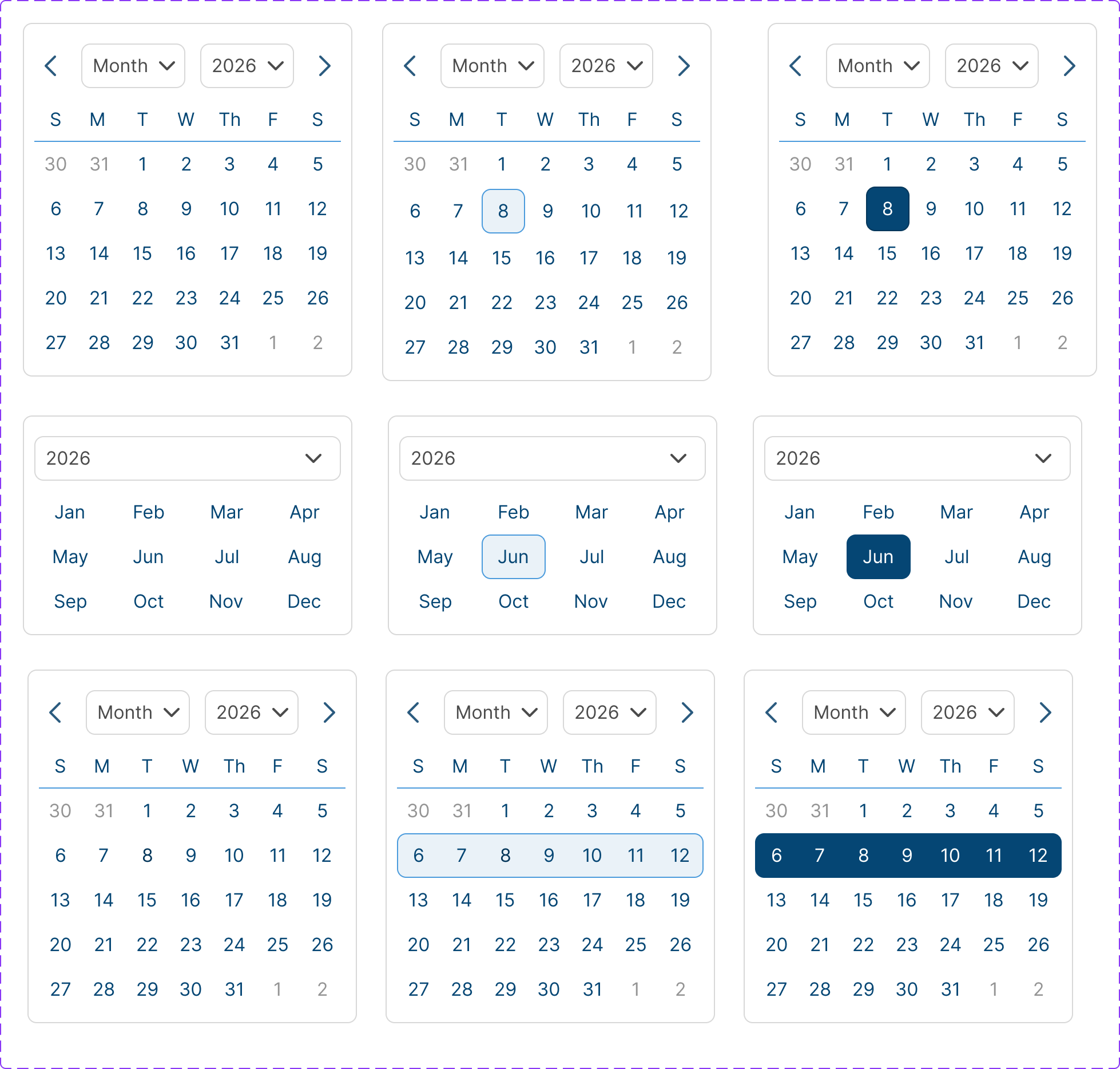
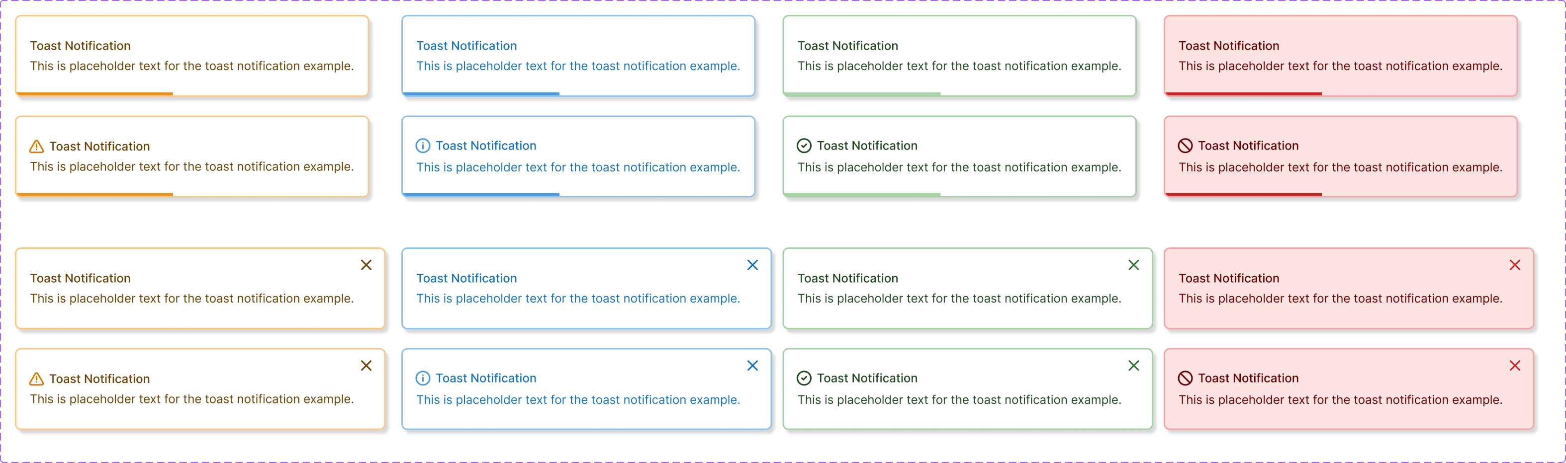
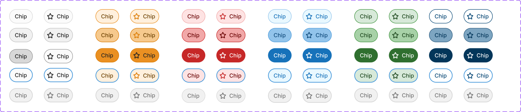
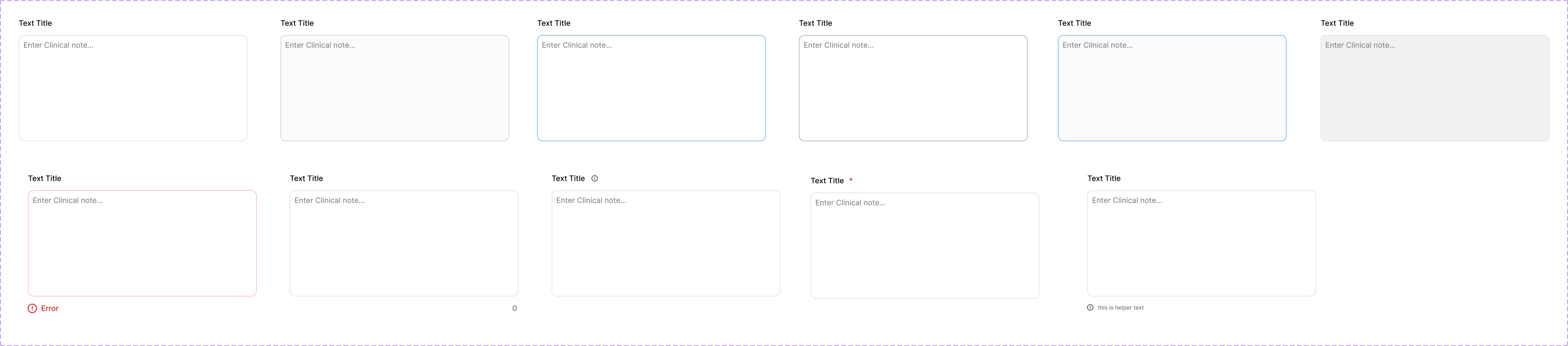
A sample of the library: date and range pickers, toast notifications by severity, chips in every color and state, and text areas from default through error.
Figma and Storybook, Kept in Sync
Figma is the source of truth. While components were being built, I met with the engineers weekly, plus extra working sessions, so what landed in Storybook matched Figma exactly. Now we audit together every two weeks to keep anything new matched on both sides. Back-end engineers no longer have to make front-end styling decisions.
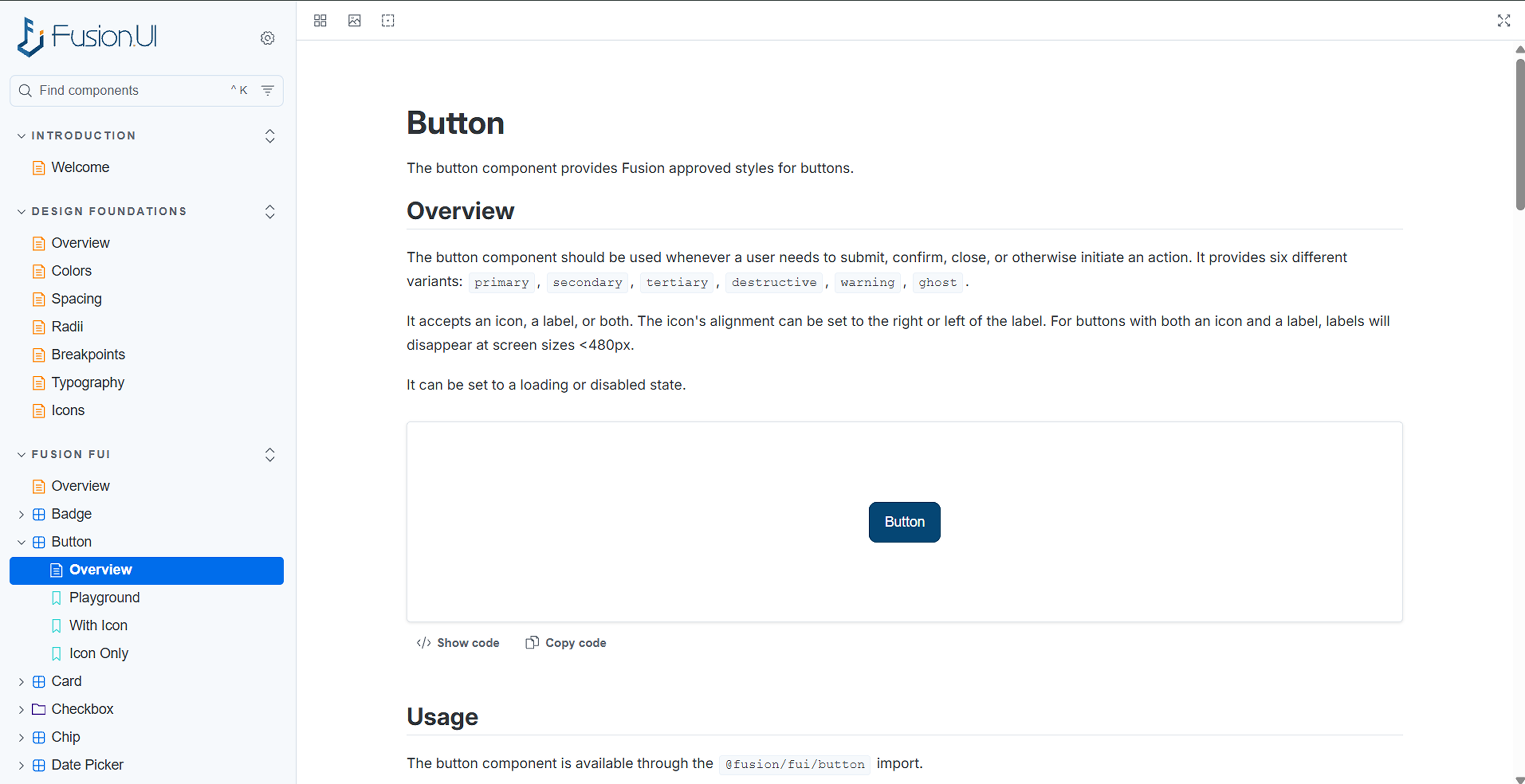
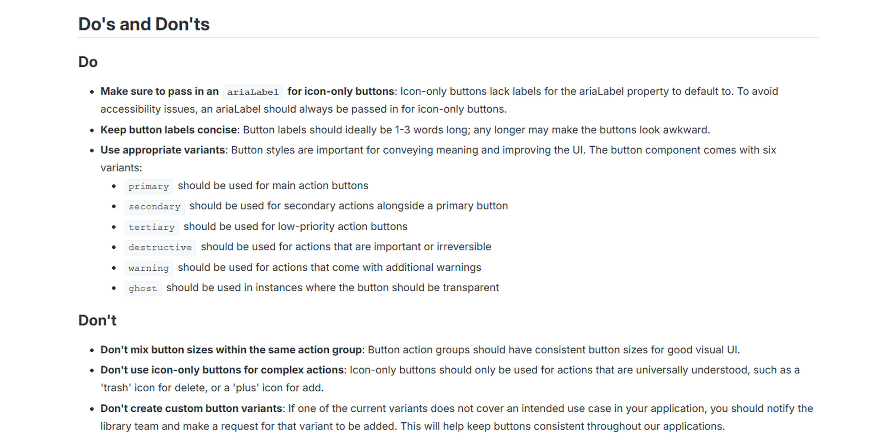
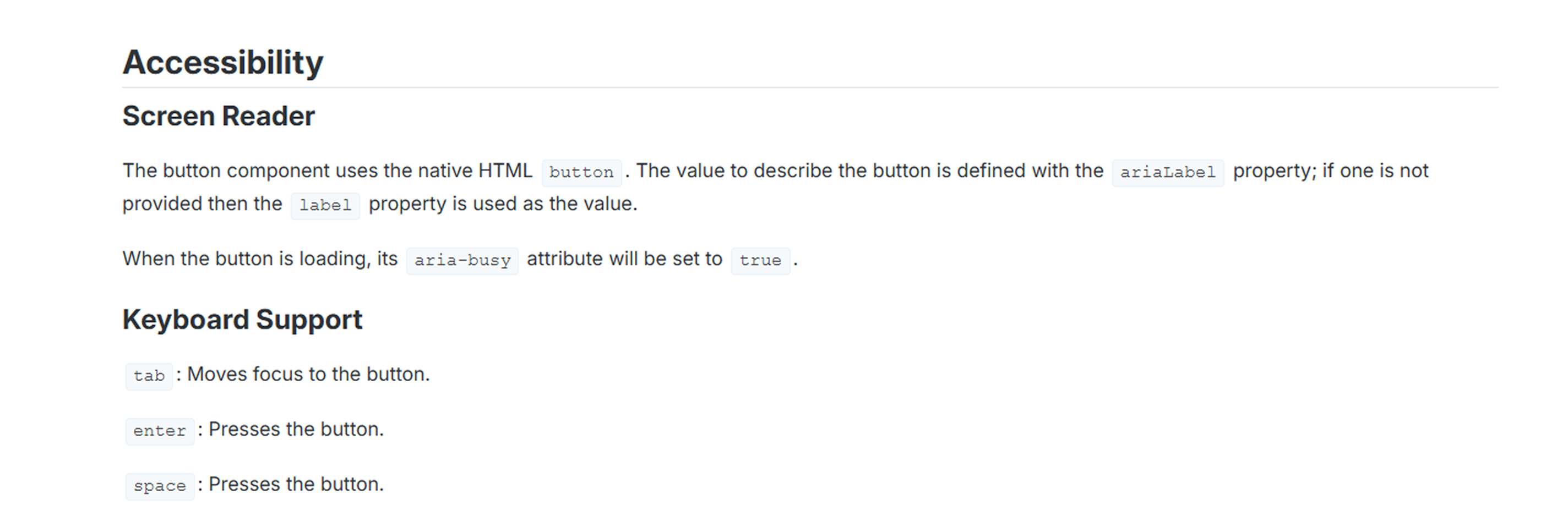
Every component ships with usage rules and accessibility notes. For buttons, that means which of the six variants to use when, with destructive reserved for irreversible actions, plus screen reader labels and keyboard support.
The Design System as AI Context
I connected a Claude project to the Storybook library, tokens, and documentation. That let me generate first iterations and clickable prototypes that were already on-system, for discovery and discussion with stakeholders. I could test several workflows and solutions without spending hours mocking up every screen, then refine the agreed direction in Figma.
Rollout
Fusion Dental was the first complete application built on the system.
The existing product suite is now getting improved workflows and component swaps, and patterns are in progress as the next layer of the system.
Fusion Dental, before and after
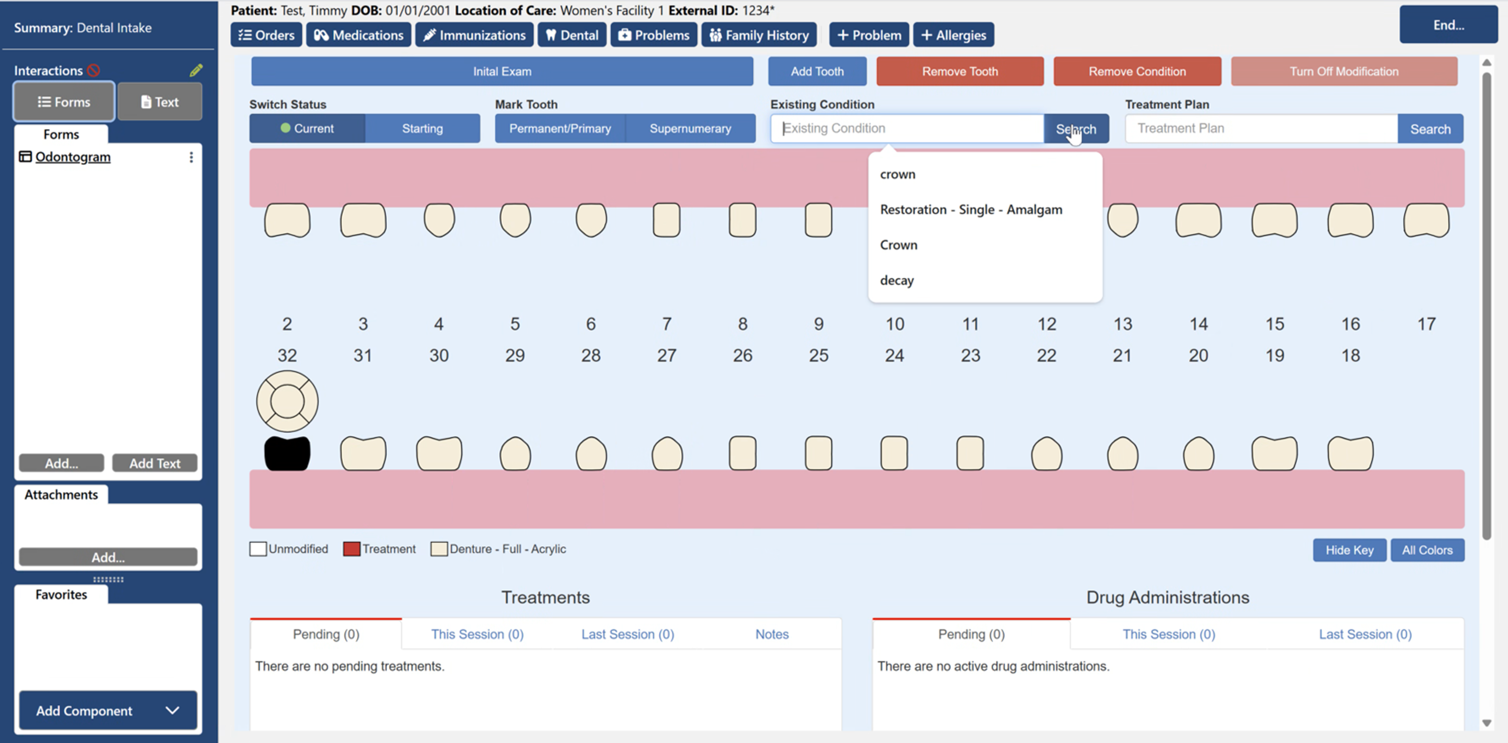
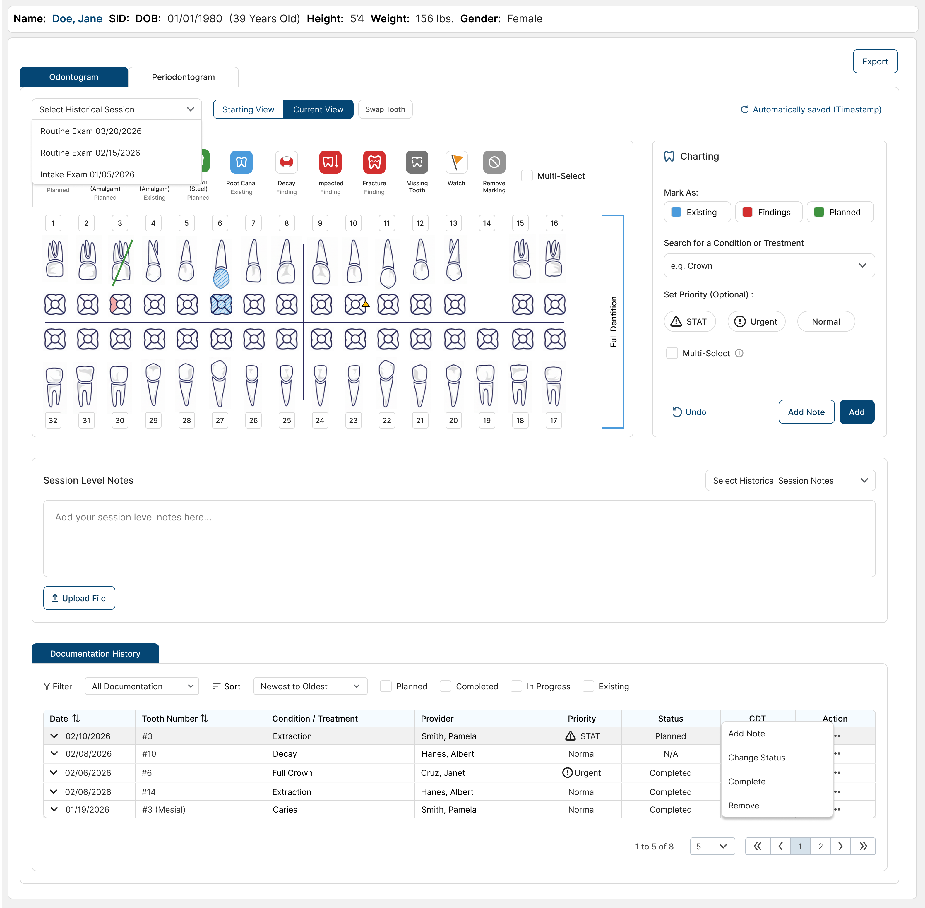
Before: dental charting with no system underneath, where red and blue are everywhere and nothing stands out. After: Fusion Dental on the design system. The layout is neutral and consistent, so color only shows up where it carries meaning: condition status and priority.
Outcome
Faster, more accurate mockups, less front-end work for back-end engineers, and the start of a consistent feel across Fusion's products.
What I took from this
Cohesiveness and accessibility can't be added screen by screen. They need a system underneath them.
Inconsistency isn't just visual. Without a system, the same outcome ends up with three or four different workflows, and users have to remember all of them.
A good design system is the foundation of a good user experience. It made our mockups and prototypes stronger while keeping everything looking and feeling like one product, and it's what lets that work scale.
Next project
↑ Back to top